Wedding Photographer Website
communicate, share inspiration, and easily book a wedding photographer
Project Background
Finding the right wedding photographer is a deeply personal decision—but many websites leave couples feeling unsure. Hidden pricing, vague timelines, and impersonal booking flows can create unnecessary stress during the planning process.
For this project, I partnered with a real wedding photographer to redesign her existing site, focusing on a more transparent and user-friendly experience. While the original lives on Squarespace, this responsive concept explores UX/UI improvements beyond platform constraints.
Inspired by interviews with recent brides, the design includes clear pricing, a streamlined client portal, testimonials, and thoughtful extras like mood board templates—all aimed at reducing friction and building trust.
Please note: While this project is based on a real photographer’s business, the redesign is a student concept created to demonstrate UX/UI thinking and is not currently live.
Scope
User Research – Understanding client and user needs to simplify client interactions and reduce drop-off rates
Branding – Working with the photographer to create a brand that meets accessibility standards and feels authentic to her.
UX/UI Design – Designing an intuitive and engaging interface that makes the lives of the photographer and clients easier.
Prototyping – Creating interactive prototypes to test and refine core features.
Usability Testing – Gathering feedback to improve functionality, accessibility, and overall user experience.
My role
I led the end-to-end UX/UI design process for this responsive website concept. This included conducting user interviews, synthesizing insights, defining goals with the photographer, creating wireframes and prototypes, and designing the full visual UI. I also explored ways to improve the client experience while maintaining the photographer’s brand personality. The final concept reflects both user needs and the creative tone of a modern wedding photography business.
Timeline
April 2025 - July 2025 (~16 weeks)
Part-time, 15 hours /week
Table of Contents
Table of Contents
Introduction
Introduction
Problem
Context
Couples searching for a wedding photographer often prioritize artistic style, pricing transparency, and clear communication throughout the planning process. But because a wedding is such a meaningful and emotionally charged milestone, the experience of choosing a photographer is just as emotional as it is practical. Many photography websites fall short in delivering the clarity and confidence couples need to feel secure in their decision.
Challenge
Unclear or hidden pricing, vague timelines, and lack of visual examples tailored to venue types or lighting conditions often lead to user frustration and drop-off. Once booked, clients frequently rely on scattered tools and emails to manage logistics, making communication feel fragmented and inefficient.
Opportunity
There is an opportunity to redesign the photographer’s website to better support both discovery and ongoing collaboration. A more transparent, visually organized, and user-centered experience can improve conversion rates, reduce client anxiety, and streamline the photographer’s workflow and benefiting both the business and the couples it serves.
Research
Research
RESEARCH Overview
To better understand the needs of couples seeking a wedding photographer, I conducted user interviews and competitor analysis. Insights revealed that clients value transparent pricing, clear timelines, and organized planning tools. They also want portfolios that feel personal and emotionally engaging, with features that simplify the booking and delivery process.
Insight
Aspect
Transparency
Clear pricing, timelines, and availability build trust.
Intuitive Tools
Calendars, filters, mood boards empower user engagement and reduce friction.
Portfolio Design
Cohesive, recent, emotionally-driven galleries with filters enhance relevance.
Communication
Organized delivery timelines, sneak previews, and self-service tools streamline planning.
Emotional Connection
Clients connect with personality, candid storytelling, and curated UX journeys.
Homepage Flow
Structure around pain points, experience value, social proof, pricing, and visuals.
Competitor Analysis
To inform the redesign of the wedding photography website, I examined design patterns and features from competitor sites offering similar services. This helped identify best practices and usability expectations for key user flows such as booking, image browsing, and style communication.
Booking and Availability
Observed Pattern: Websites allow users to view calendar availability and book directly.
Key Feature: Interactive scheduling tools integrated into the website.
Design Insight: Simplifying the booking process by surfacing available dates improves ease of planning and increases user confidence in reserving a session.
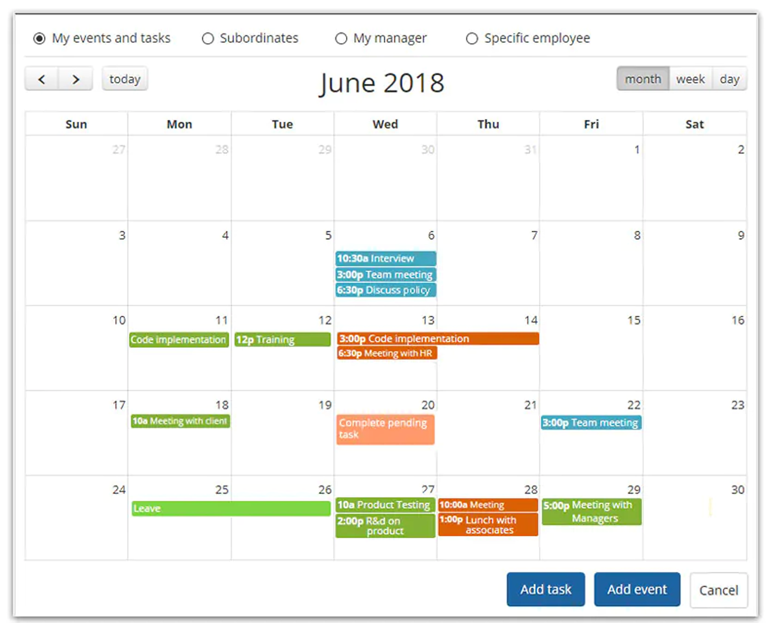
Photo Gallery Access
Observed Pattern: Photographer portfolios offer filtering and browsing tools for public and client galleries.
Key Feature: Filters for location, event type, or photo style.
Design Insight: Users benefit from easy-to-navigate galleries that let them assess the photographer’s style quickly. For clients, filtered access to their own session photos enhances post-shoot usability.

Organized workflow
Observed Pattern: Internal task management tools help photographers stay organized.
Key Feature: Checklists and scheduling visibility.
Design Insight: Including tools for task tracking supports a smoother experience for both the photographer and client, especially during busy wedding seasons.
Observed Pattern: Mood board creation tools, sometimes AI-assisted, help clients communicate their vision.
Key Feature: Style board creation using uploaded or referenced imagery.
Design Insight: Allowing clients to create a mood board gives them a voice in the creative process, helping align expectations and reduce pre-session ambiguity.
Client Interactive Features
Interview Insights
I created an affinity map to synthesize all my interview information, and this gave me 6 main points to focus on when designing a website that works well for both the clients and the photographer herself.
Booking and availabilitY
Users want a visual calendar showing availability, preferably color-coded by session type (e.g., weddings, family)
Transparency in pricing upfront (including "starting at" rates) helps prevent uncomfortable budget mismatches
Users prefer to see specific photo delivery dates instead of general time ranges
Short sessions and full wedding day availability should both be visible
An intake quiz or form to estimate pricing based on session details (guest count, venue, etc.) would simplify decision-making
Portfolio Expectations
Users prioritize updated, high-quality portfolios showcasing recent work and the photographer's personality
Candid, emotional moments are highly valued over posed perfection
Photographer's style and personality matter more than technical equipment specifications
Familiarity with the venue is appreciated but not required
Communication Preferences
Users strongly prefer essential information (pricing, availability, gallery examples) to be readily accessible on the website rather than requiring email or phone contact
Communication during and after booking should be organized and efficient, minimizing scattered emails, DMs, or messages
Customization and Collaboration
Mood board features (drag-and-drop, AI-enhanced) allow clients to align vision and style early in the process
Clients want tools to:
Build inspiration boards with a mix of photographer’s and client-sourced images
Select preferred shot types via a wedding photo checklist
Share day-of schedules and expectations clearly with the photographer
Gallery Experience & Photo Delivery
Online galleries should:
Be organized by event (e.g., getting ready, ceremony, reception)
Allow filtering by key people (e.g., bride, groom, family members)
Stay available long-term or indefinitely for downloads
Include clear download deadlines
Clients like receiving a preview set of edited photos ahead of the full gallery
Bulk galleries should be searchable and intuitive—possibly including AI-assisted sorting or tagging
Social Proof & Add-Ons
Reviews paired with real example photos help users trust the quality of service
Clients appreciate:
Clear, upfront info on add-on services like outfit planning or mood board building (+$100 was seen as acceptable)
The ability to make galleries public (with opt-in consent)
Print purchase options through the website, but they dislike persistent email upselling
Persona
TARGET AUDIENCE
Elise represents the ideal target user for this wedding photography website. She’s a modern, detail-oriented planner who values style, clarity, and efficiency. While most of the brides I interviewed were in their 20s, I chose to make Elise 32 to reflect the photographer’s goal of reaching clients in larger cities, where people often marry later. She wants a photographer who aligns with her creative vision and budget, and plans most of her wedding online, highlighting the need for intuitive, self-service tools.
FEATURE ALIGNMENT
The website’s features are designed around the needs of brides like Elise. Based on interviews, users want:
Upfront pricing with minimal back-and-forth
A visual calendar to check availability
Editable mood boards to align vision early
Tools like shot lists and delivery timelines to reduce uncertainty
Organized galleries and filters for browsing large collections
These features address the most common pain points: unclear pricing, clunky communication, and uncertainty about visual fit.
DESIGN CONSIDERATIONS
Elise’s story also helped guide broader design decisions. While she’s the primary persona, the site is built to support a range of clients, from ultra-organized planners to more flexible users. The structure prioritizes clarity and ease:
Key info (pricing, availability, reviews) is surfaced early
Collaborative tools support both client and photographer
The interface is clean, mobile-friendly, and emotionally warm
For style, I chose visual preferences that align with the photographer’s brand, while showing Elise’s distinct vision—demonstrating the photographer’s ability to adapt. Elise also creates a spreadsheet to weigh her options, reflecting a more analytical mindset I saw in several interviewees—especially those with UX backgrounds. The site’s organization is designed to support that kind of decision-making with ease.
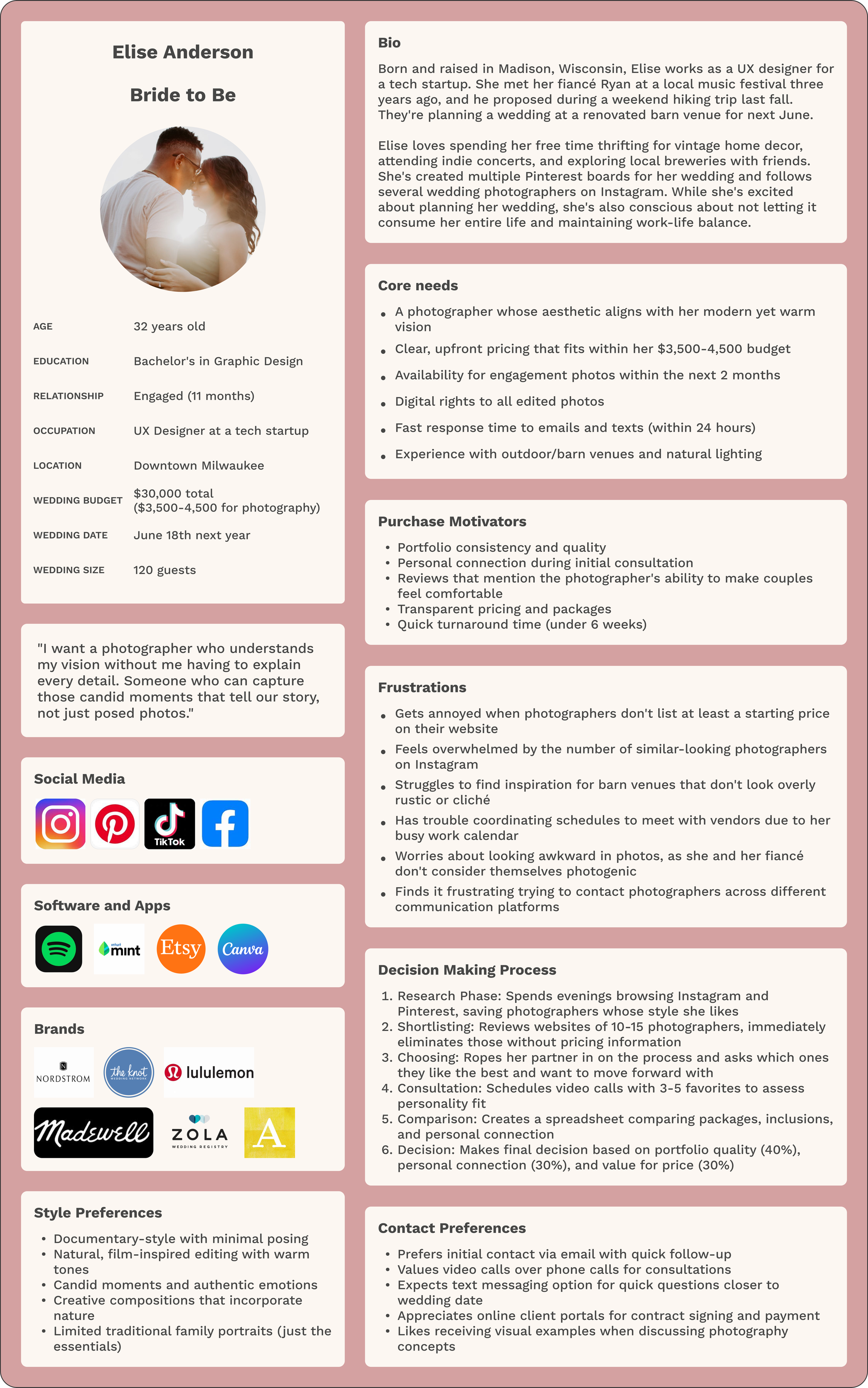
Problem Statement
Elise is searching for a wedding photographer whose artistic style aligns with her vision and whose services fit comfortably within her budget constraints. Like many couples, she finds the process overwhelming due to unclear pricing, difficulty visualizing the final results, and concerns about missing important moments of her special day.
💡 insights
🔍 Needs
⚙️ How Might We’s
Pricing transparency frustration: Prospective clients become frustrated and often abandon websites when pricing information is hidden, vague, or requires contact before being revealed
A clear, comprehensive pricing structure that outlines package options, customization possibilities, and what each price point includes
How might we present pricing information in a way that is transparent yet doesn't overwhelm clients or devalue our artistic expertise?
Location visualization concerns: Couples need to see how their specific venue or similar settings would look through the photographer's lens before feeling confident in their decision
A diverse gallery organized by venue types (indoor/outdoor, rustic/elegant, etc.) and lighting conditions (day/evening) to help clients envision their own event
How might we organize our portfolio to help clients quickly find relevant examples that match their planned venue and style?
Shot list anxiety: Clients worry about missing important moments or family combinations and want reassurance that all key photographs will be captured
A collaborative planning system that combines photographer expertise with client priorities to ensure comprehensive coverage
How might we create a structured yet flexible approach to shot planning that balances our professional judgment with the client's unique priorities?
Style compatibility concerns: Couples struggle to articulate their preferred photographic style and worry about misalignment with their chosen photographer
Visual tools that help clients identify and communicate their aesthetic preferences effectively
How might we develop an intuitive style-matching process that helps clients confirm we're the right artistic fit before booking?
Budget-value disconnect: Clients have difficulty understanding what represents good value in wedding photography and why prices vary so significantly
Education about what influences photography pricing and what vaue each component provides.
How might we educate clients about the value components of wedding photography in a way that justifies our pricing without being defensive?
Timeline uncertainties: Couples are unfamiliar with how much time different photography elements require and struggle to plan their wedding day schedule appropriately
Clear guidance on timing requirements for different types of shots and coverage options
How might we help couples develop realistic photography timelines that ensure quality results without causing wedding day stress?
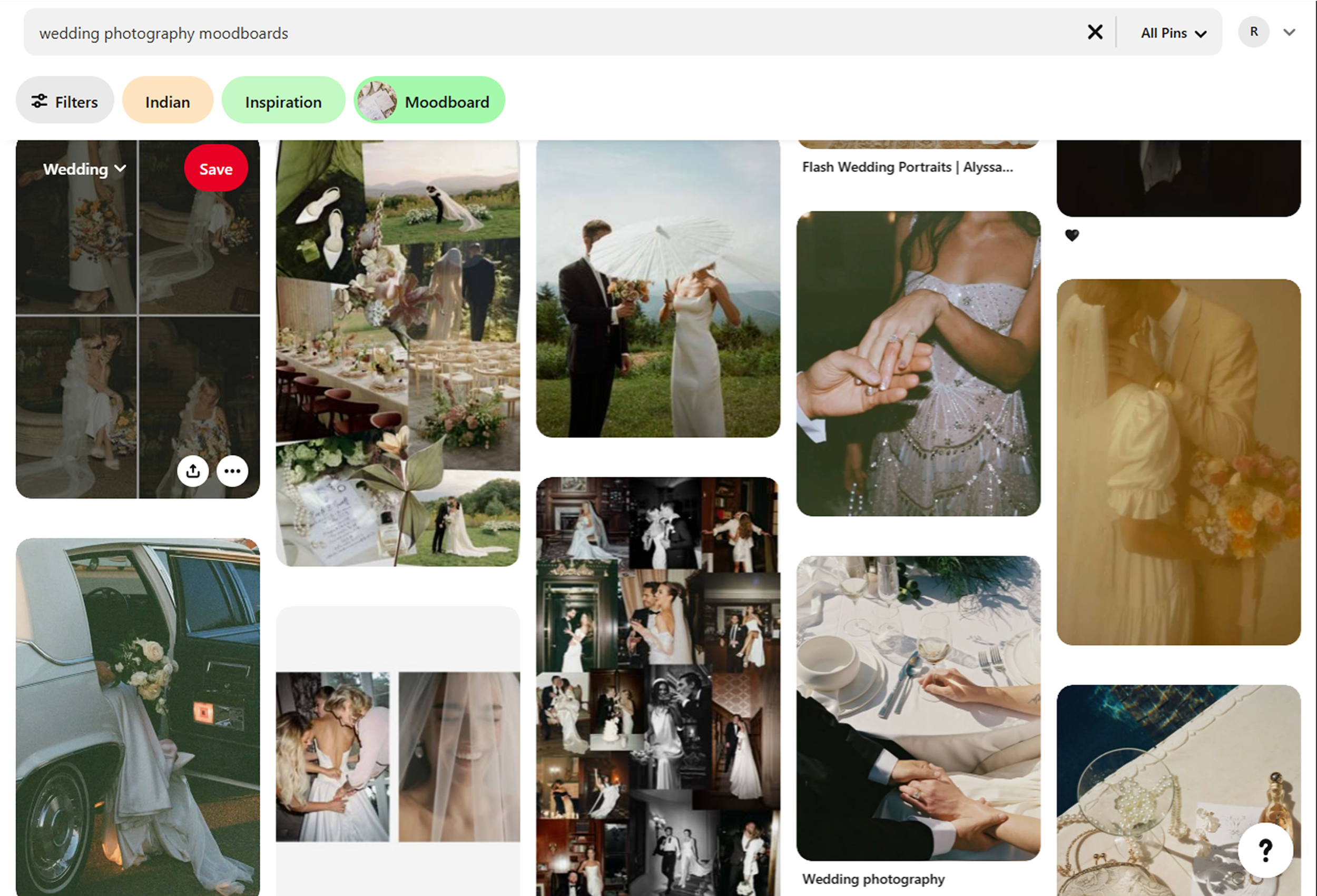
Mood board integration challenges: Clients collect inspiration on various platforms but struggle to effectively share and discuss these references with their photographer
A seamless mood board feature that integrates with popular inspiration platforms and facilitates meaningful discussion
How might we create a mood board system that connects with clients' existing inspiration sources while guiding them toward achievable results?
Post-wedding delivery anxiety: Couples feel uncertain about when they'll receive their images and what the selection and editing process involves
Transparent explanation of the post-wedding workflow, with clear timelines and expectations for delivery
How might we create a post-wedding process that keeps clients informed and excited rather than anxious about their photo delivery?
Project Goals
User Goals
Discover photographer’s style and specialty through a curated portfolio
Visualize their wedding through the photographer’s lens
Quickly find clear pricing without contacting the photographer
Access a simple contact method for inquiries and booking discussions
Share vision and preferences via inspiration boards and reference images
Understand the full process from booking to final delivery
Read testimonials to build confidence
Get must-have shots without micromanaging
See full wedding galleries to understand consistency
Shared Goals
Maintain clear communication to keep client and photographer aligned
Use shared vision boards to translate ideas into visual plans
Create an intuitive website with simple navigation
Strategically highlight best work to attract ideal clients
Offer multiple support touchpoints for questions and booking
Set clear expectations for timeline and deliverables
Foster collaboration that balances guidance with client preferences
Business Goals
Establish a distinctive brand identity
Increase traffic and conversions with SEO and UX design
Minimize inquiries from unfit clients
Clearly set expectations for pricing, process, and deliverables
Create efficient workflows to ensure timely delivery
Generate reviews and referrals for word-of-mouth marketing
Develop brand loyalty for repeat business
Scale with associate photographers maintaining brand standards
Justify premium pricing with exceptional service
feature set
Guided by user interviews and market research, I developed a feature prioritization matrix that aligns user needs with implementation feasibility. The roadmap emphasizes essential planning and communication tools first, while reserving more personalized and advanced features for future updates based on client feedback and engagement trends.
Price Transparency
Quiz or Interactive pricing tool where clients can select their basic package and add/remove components. "Starting At" price guide examples.
Must Haves
Priority 1:
Client Communication Portal
Dedicated platform for all wedding-related communication. Maintains organized record of all decisions and discussions.
Mood Board
Visual tool where clients can select favorite images from your portfolio. AI-powered analysis identifies patterns in their selections. Generates personalized shot recommendations based on preferences.
Nice to Have
Priority 2:
Guided Inquiry Process
Multi-step contact form that collects key information for meaningful first response. Includes budget comfort range as dropdown options.
Before & After Editing Samples
Showcase editing process with sliders comparing RAW to finished images.
Surprising and Delightful
Priority 3:
Wedding Day Timeline Generator
Helps organize what shots need to be taken when, to make sure the people who are needed for a shot are around and keeps everything moving smoothly.
Can Come Later
Priority 4:
Journey Map
I created a journey map to highlight the major pain points brides experience when choosing and booking a photographer. The analysis showed that the highest friction occurs during the initial contact stage. If pricing or an estimate is not visible upfront, many potential clients disengage before reaching out. Providing brides with clear pricing and essential details earlier in the process can reduce the number of casual inquiries while increasing the percentage of inquiries that convert to bookings.

Initial Prototyping
Initial Prototyping
Low and MID Fidelity
To begin the prototyping phase, I created mid-fidelity wireframes that aligned with the photographer’s existing brand. Since she already had a functioning website with established imagery and stylistic choices, I used those as a foundation to ensure visual consistency and familiarity.
The primary goal at this stage was to focus on the site’s structure, flow, and functionality—making sure users could easily navigate and access the content most relevant to them. I used this phase to experiment with layout options and refine the overall information architecture.
Following the creation of these wireframes, I conducted user testing to identify gaps in the experience and gather early feedback. This helped surface a few missed opportunities and guided revisions before moving into high-fidelity design.
To accommodate the needs of multiple user types—namely the photographer, current clients, and prospective clients—I explored a set of differentiated screens. Each group required varying levels of access and privacy, so I designed flows that reflected those needs:
Public-facing content for new visitors
Client access portals
Private photographer dashboard
These distinctions helped ensure a seamless and secure experience tailored to each user type.
Public-Facing Content for new visitors
The homepage design evolved through multiple iterations, beginning with a foundation similar to Ashley's existing website to maintain brand familiarity. I explored several creative directions, experimenting with different layouts, visual hierarchies, and content arrangements to find the most effective approach.
Through this iterative process, I tested various ways to showcase Ashley's photography while ensuring clear navigation and compelling calls-to-action. Each version built upon insights from the previous iteration, gradually refining the balance between visual impact and functional usability. The final design successfully combined Ashley's artistic aesthetic with improved user experience, creating a homepage that both captivates potential clients and guides them seamlessly through the booking process.
Internal Dashboards
I designed both the client-facing and internal photographer dashboard interfaces, focusing first on information architecture and core functionality for each user type. For the client dashboard, the early iterations successfully defined key user interactions and content structure, setting the stage for visual refinement.
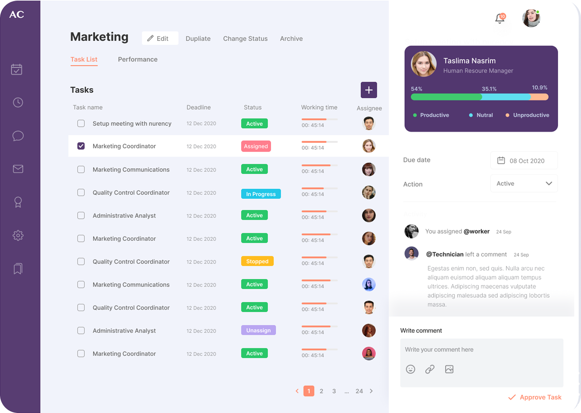
For the photographer's internal dashboard, I prioritized organizational tools and centralized workflow management. This included consolidating client communications, booking schedules, project timelines, and administrative tasks into a single, streamlined interface to help Ashley manage her business more efficiently.
Both dashboard concepts provided solid frameworks but required visual refinement to improve usability and aesthetic quality. The next phase involved optimizing the layout hierarchy and enhancing the aesthetic treatment to create more polished, user-friendly experiences tailored to each user's specific needs.
Note: I had initially designed using the pink and red colors to set the photographer apart from other designers. But the colors were just a place holder and were changed later to reflect the wants of the photographer.
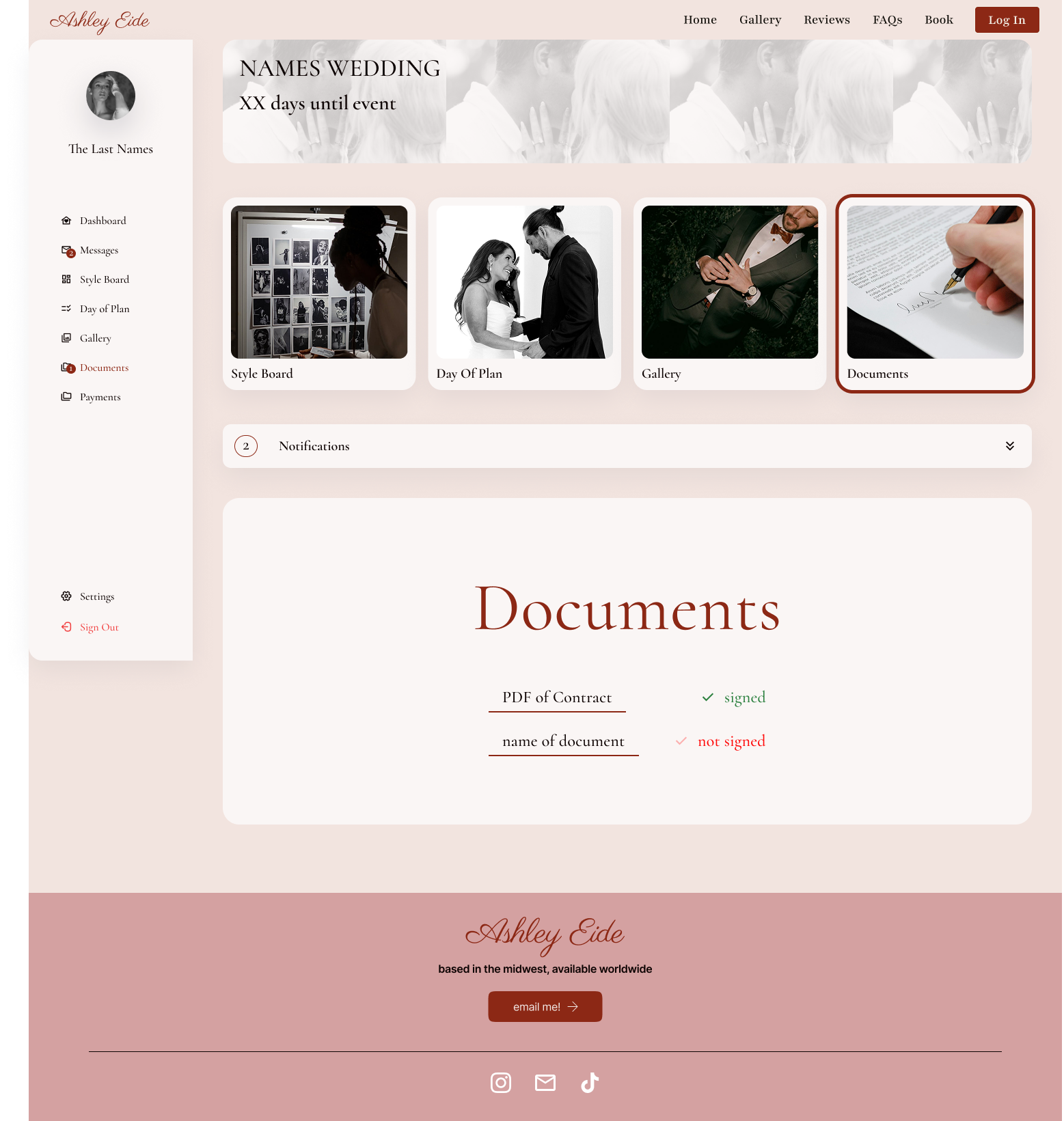
Client Access Portals
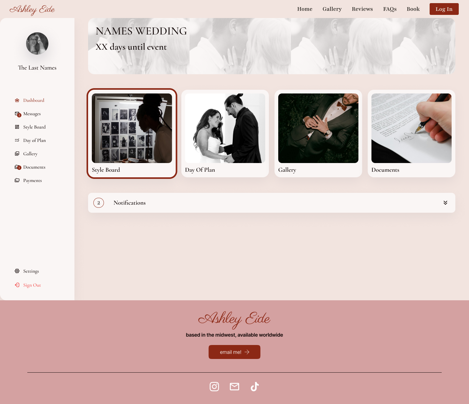
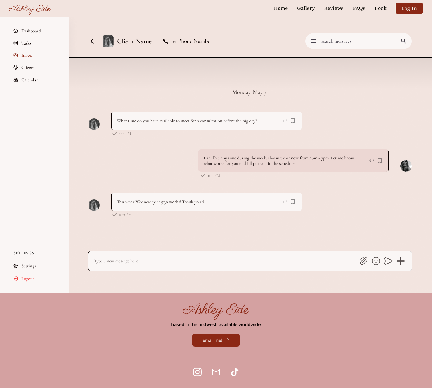
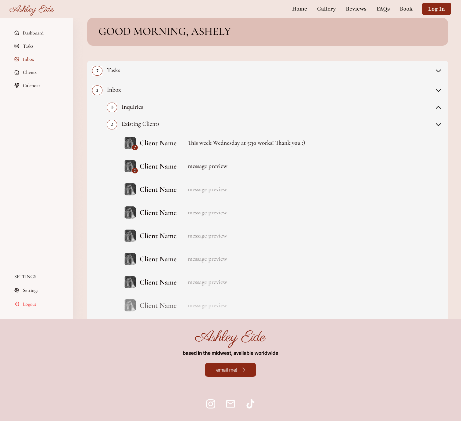
Private photographer dashboard

User Flow Maps
I developed comprehensive user flow maps to define how different user types would navigate the site, distinguishing between client booking journeys and photographer administrative workflows. These initial flows provided the structural foundation for content organization and feature prioritization. As user interviews revealed deeper insights into actual behaviors and pain points, I refined the flows to create more intuitive pathways that truly reflected user needs and business objectives.
CLIENT User Flows
Clients interact with the website in two phases:
Before creating an account (exploring availability, pricing, and gallery examples)
After logging into their dashboard (accessing tools and communication features)
Design Rationale:
Setting up the flow to allow clients to check availability and get a price estimate before committing to an account was intentional. This lowers the barrier to entry while guiding users toward booking. Once inside their dashboard, tools are laid out to help them stay organized and feel confident about the upcoming shoot.
Key Flows Include:
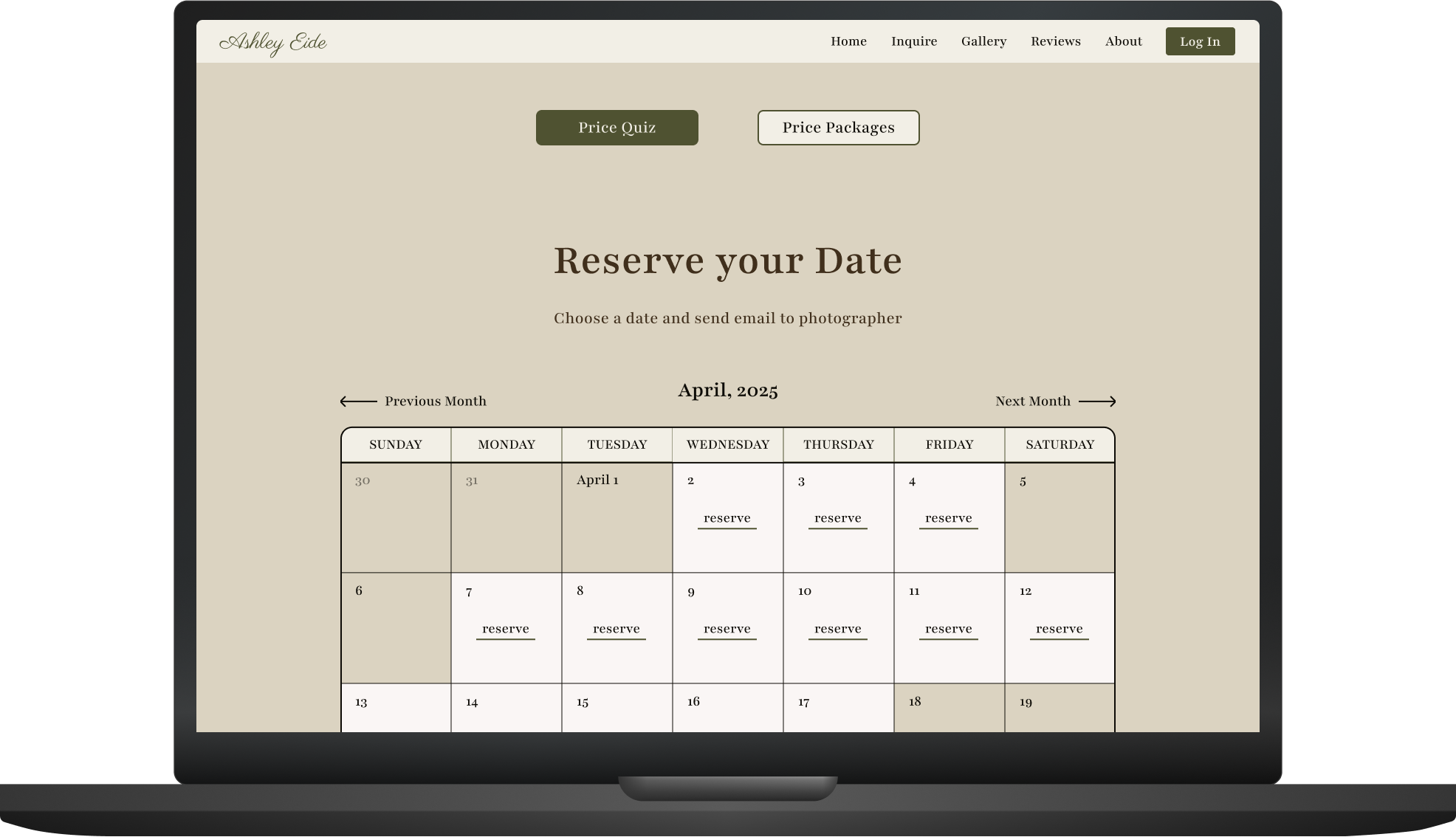
Booking Inquiry: Visitors can select a date to check the photographer’s availability and initiate an inquiry before needing to make an account
Price Quiz & Account Creation: A simple price estimation quiz leads naturally into account setup for more personalized service
Dashboard Access: Once logged in, clients can view their model gallery, messages, favorites, and scheduling tools
Interactive Features: Clients can build inspiration boards and shot lists, edit them, and communicate with the photographer directly in their portal
Photographer User Flows
The internal photographer experience was designed to be highly functional and streamlined. This flow is optimized for daily use, helping the photographer stay organized with minimal friction.
Key Flows Include:
Messages: Unread/read status helps prioritize responses quickly
Client Management: Photographers can view client profiles, galleries, style preferences, and associated tasks
Task Tracking: From the client’s style board to the day-of shot list, everything can be broken down into actionable tasks
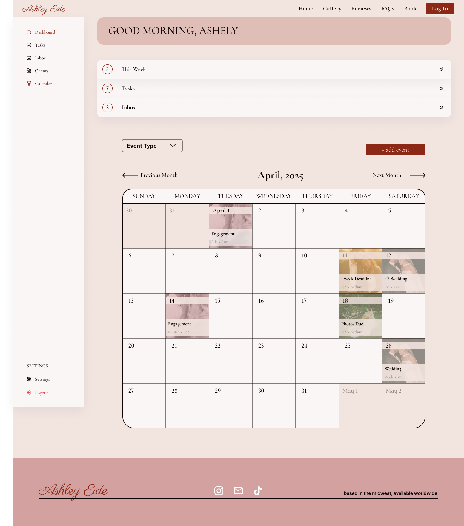
Calendar Integration: A visual calendar helps track upcoming shoots and sessions
Gallery Management: Private and public gallery settings give control over what clients and future clients can view
About Me Section: Easily accessible for updating business details, bio, or pricing info
Design Rationale:
The photographer flow was built to reduce cognitive load and streamline daily operations. Whether checking messages, managing galleries, or tracking deliverables, the site structure supports efficiency without sacrificing usability.
User Testing Summary
Method: 1:1 Moderated User Testing (Prototype walk-through + verbal feedback)
Participants: Clients (brides-to-be or newlyweds), ages mid-20s to mid-30s
Stage Tested: Low- to Mid-Fidelity Prototype
“This is really helpful and I could see it being used as a template for other photographers or small businesses."-Ashley (The Photographer)Key Findings
1. Booking Transparency Was a Top Priority
Users strongly preferred to check availability and estimated cost before creating an account
The calendar and “price quiz” features were seen as helpful, but users wanted quicker confirmation on whether a date was open
2. Reviews & Galleries Build Trust
Seeing real reviews and example galleries helped users feel confident in the photographer's style
Public galleries were especially valuable for understanding consistency across weddings
3. Communication Should Feel Easy and Personal
Users wanted an easy way to message the photographer, especially after booking
There was appreciation for the ability to keep track of messages, shot lists, and scheduling in one place
4. Dashboards Felt Useful — but Only After Booking
The client dashboard features (shot list builder, messaging, inspiration) were exciting, but only became relevant after securing a booking
Some testers were confused when shown the dashboard too early in the flow
Iterations Made After Testing
🎨 Visual & Structural Updates
Standardized the homepage design by using only color photographs to separate sections, creating a more cohesive and modern look (instead of mixing in black-and-white imagery)
Chose a gallery layout with mixed photo sizes, which users felt was more dynamic and representative of a real portfolio
💸 Booking & Inquiry Flow
Replaced the right-side slide-out price quiz with a centered pop-up quiz for a more focused experience
Simplified the quiz layout by stacking answer buttons vertically, allowing users to click through quickly and intuitively
Expanded time selection options in the booking flow so users could be more specific about what type of session or coverage they wanted to reserve
Revised the calendar design to feel less visually overwhelming while still clearly communicating which dates were available
📋 Shot List Enhancements
Updated the shot list feature by:
Adding checkable boxes for each item.
Allowing users to add custom shots
Including a space to paste existing shot lists or external links for easier planning
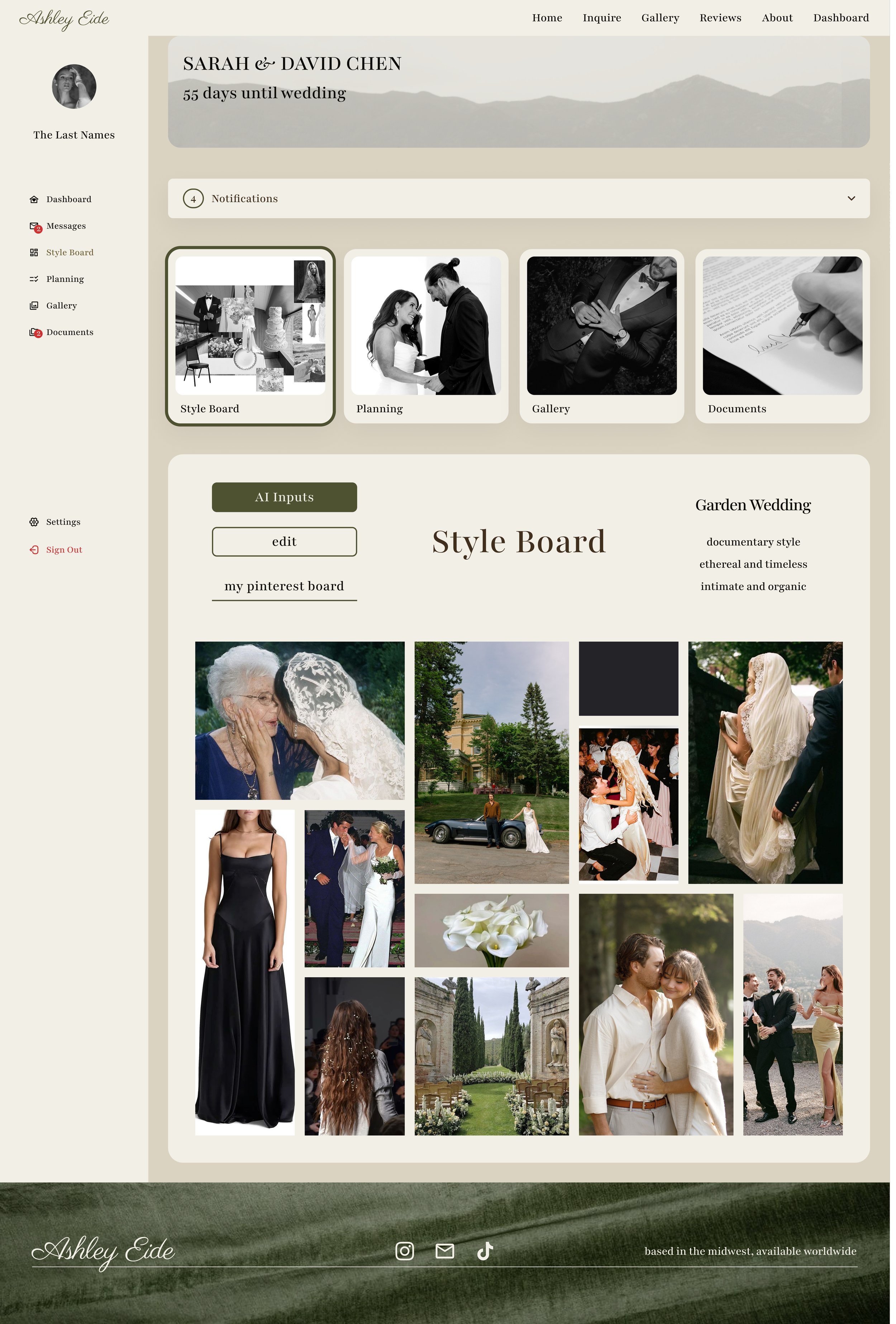
📌 Style Board Improvements
Improved the hierarchy of the AI-generated style board and added the ability for users to:
Replace individual images within their board
Re-edit the AI prompts if they weren’t satisfied with the initial results
Included an optional Pinterest board link, making it easy for both the user and photographer to reference inspiration in one place
🧭 UI Behavior Feedback
Some users had mixed feelings about the left-hand dashboard being always open; however, the majority preferred it that way for easier navigation and task awareness. Based on that feedback, it remains persistent across relevant pages
📁 Photographer Dashboard Updates
Created a clearer separation between current and past clients by adding “Closed” sections in both the messages and client lists
Split task management into “Upcoming Tasks” and “Completed Tasks” to help the photographer stay organized
Added wedding date and location summaries directly to each client entry, providing quick access to key event details
Branding
Branding
Co-Creating the Brand Experience
To ensure the final design reflected the photographer’s aesthetic and vision, I collaborated closely with her after completing the mid-fidelity prototypes. During our review session, we refined key visual elements together:
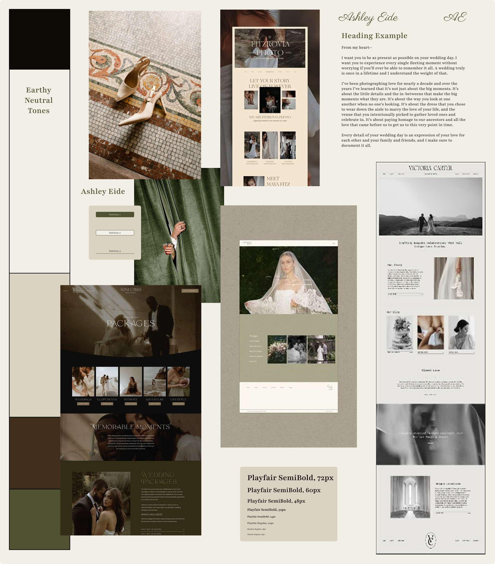
Typography: I presented multiple font pairings, and we selected Playfair Display for its elegant, editorial quality—matching the romantic and timeless feel the photographer wanted to convey across the site.
Color Palette: I initially explored bold alternatives to help her stand out, but we ultimately opted for tones that aligned with her existing brand and portfolio. The palette was adjusted to incorporate earthy neutrals like sage, cream, and deep brown, complementing the natural warmth of her photography.
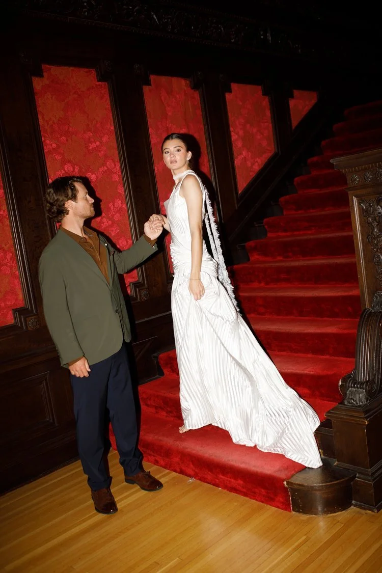
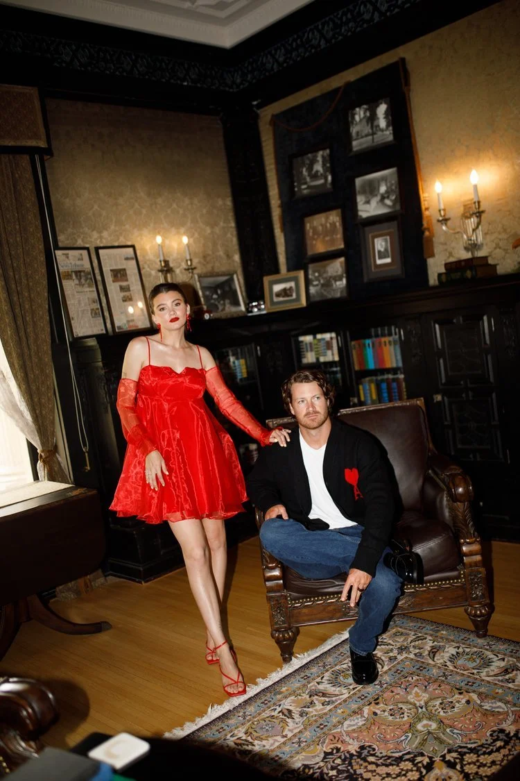
Imagery: The photographer provided additional high-quality photos and a super 8 video, which I incorporated into the layout. Her hero image selection helped shape the tone of the homepage immediately upon landing.
Mood & Style: Inspired by refined minimalism and rich textures, the mood board guided the creation of a cohesive brand presence from button treatments to gallery styling.
This collaborative process ensured the final website was not just user-friendly, but also an authentic extension of the photographer’s brand and visual storytelling style.
Usability Testing
Usability Testing
usability Testing
The primary goal of usability testing was to ensure that users—particularly busy brides planning their own weddings—could quickly and easily access key information such as pricing, availability, and personalized tools to stay organized throughout the wedding process.
My main user persona leads a fast-paced lifestyle but is hands-on when it comes to wedding planning. She expects a self-serve portal where all wedding photo-related details are easy to find, update, and communicate about—without relying on back-and-forth emails.
I conducted 1:1 moderated usability testing sessions with users who matched the target persona. Each session included a live walkthrough of a high-fidelity prototype, during which users were asked to speak aloud while completing specific tasks. I observed how intuitively they navigated the site and gathered feedback on both functionality and design.
On the internal DashboarD
“This is really nice. I wish I had this for my... Someone tell me what I was doing every day.”
- Kelsey
On booking and finding the price
“I think I would hesitate pressing book with me because I know right away it's not within my budget.”
- Adam
On the calendar
"I really like the calendar. Because the dashboard is, like, obviously great and tells me immediate action items, but I like, I'm a, I'm a big planner."
- Rachel
On the overall flow
“This is really nice. I wish I had this for my [work] Someone tell me what I was doing every day.”
- David
Core Tasks & Prompts
General Exploration
Open the website and explore freely. What’s your first impression?
How would you go about finding pricing or an estimated quote?
Can you figure out how to reserve a date and send a notification to the photographer?
Client Dashboard Tasks
Create an account and sign in
Once logged in, explore the dashboard
Does it match your expectations for what you'd want access to?
Is anything missing or confusing?
How would you send a message to the photographer?
How would you find and customize your shot list for the day of the wedding?
Photographer Dashboard Tasks
Check what tasks need to be completed and mark the first few as done
Open the inbox and respond to any new messages
Look up the Chen wedding and access their client dashboard
Find the engagement session for Ella and Sam in the calendar
Add a new event to the calendar for an upcoming booking
Insights From testing
What Users Want Most
Pricing transparency before any commitment
Non-committal language in booking flow
Dashboard sharing with family/partners
Visual clarity in calendars and tasks
Biggest Wins
Simple, clean aesthetic
AI-powered style boards
Unified messaging system
Color-coded task management
Critical Issues
Pricing discovery friction
Booking language confusion
Missing sharing functionality
Calendar workflow problems
Changes Made
Pricing Discovery
Challenge: Users struggled to find pricing information efficiently during the booking process.
Solution: Restructured the pricing presentation by relocating pricing buttons to the top of the booking section and integrated pricing CTAs within the about page content.
Impact: Improved information accessibility and provided multiple touchpoints for users to access pricing details throughout their journey.
Booking Clarification:
Challenge: Users were confused about the booking process and commitment level during initial inquiries.
Solution:
Added clarifying text within the booking quiz explaining that users are only reserving dates and reaching out to photographers
Implemented clear messaging stating "THIS IS NOT A BINDING AGREEMENT"
Established automated notification system to inform photographers of potential matches
Impact: Reduced user anxiety about commitment and improved communication transparency between clients and photographers.
Gallery
Challenge: Empty gallery states created poor user experience and limited sharing capabilities.
Solution:
Implemented placeholder states for galleries without content
Added download and sharing functionality for completed galleries
Created user-friendly options for clients to share galleries with others
Impact: Enhanced user engagement and provided value-added features for content distribution.
About Page
Challenge: Homepage contained excessive text and lacked visual preview of photographer dashboard.
Solution:
Relocated detailed photographer information to dedicated about page
Reduced homepage clutter by streamlining content
Added visual preview section showing potential clients what the internal dashboard interface looks like
Impact: Improved homepage conversion potential and provided transparency about the photographer's professional tools.
Photographers internal:
Challenge: Photographers needed better task management and client communication tools.
Solution:
Added inquiry management section to differentiate between new inquiries, existing clients, and past clients
Implemented personalized background images to enhance the creative professional aesthetic
Integrated calendar functionality with due date/deadline tracking
Streamlined calendar view to show only active shooting days
Impact: Improved photographer workflow efficiency and enhanced the professional user experience for service providers.
All these changes and more can be seen in the high fidelity prototypes below.
High Fidelity
High Fidelity
Interactive Prototype
The high-fidelity prototype incorporates all key updates from the latest round of usability testing, including improvements to navigation, information architecture, user flow, and role-based functionality. The design balances the needs of public visitors, clients, and the photographer while maintaining a consistent visual identity across all interfaces.
Designed in Figma, the clickable prototype allows users to experience the complete platform, from public browsing to client portal management and photographer dashboard tools. A persistent sidebar navigation enables seamless switching between public, client, and photographer views.
This version reflects a polished and fully functional vision of the platform, showcasing how user feedback directly shaped design decisions.
Click either image below to explore all three interfaces.
Public and Client Facing
Photographer internal

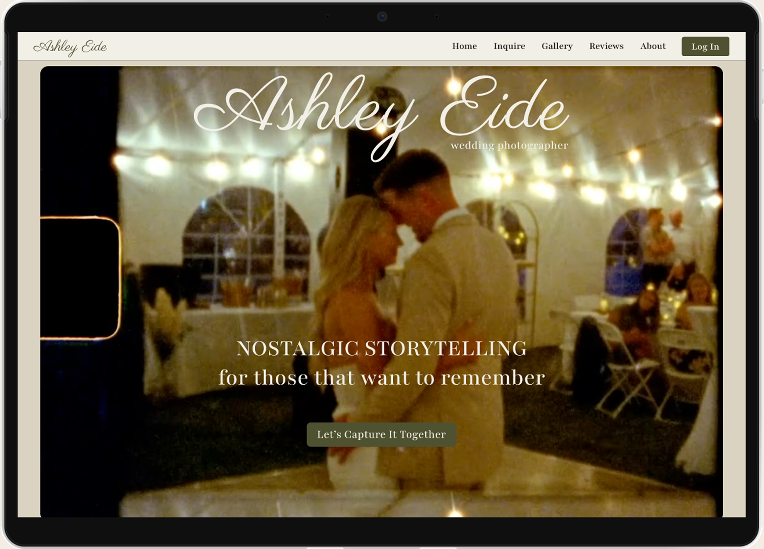
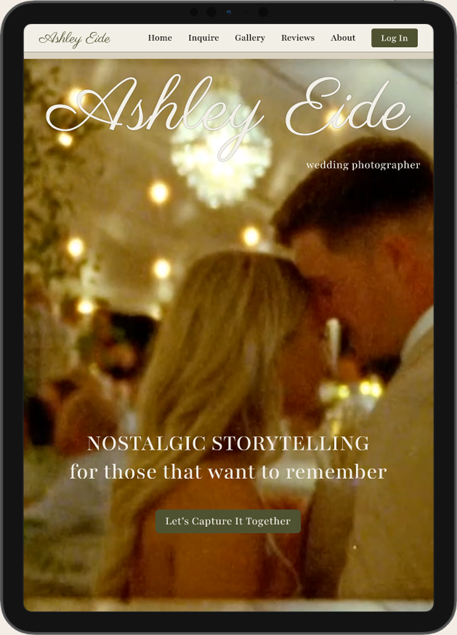
Responsive Web Design
Responsive Web Design
Responsive Website
To ensure the site was accessible and user-friendly across devices, I designed a fully responsive layout that adapts seamlessly to phones and tablets.
Users can comfortably browse, plan, and access galleries whether on the go or at home. I optimized spacing, text sizing, and layout components for touch interaction and readability on smaller screens.
I also built an interactive prototype that mimics the live site experience. It highlights core features, meets contrast and accessibility standards, maintains clear navigation and hierarchy, and ensures realistic usability testing for a smooth, inclusive experience.
Click the images below to explore the tablet or phone prototypes.
Tablet
Phone

Future Considerations
Future Considerations
As the client dashboard is put into regular use, we plan to continuously gather feedback to improve the overall experience. Observing how clients navigate and interact with the portal will help us identify any gaps in content, functionality, or flow, allowing us to make informed updates that better align with client needs and the photographer's offerings.
One key area of development is the pricing quiz algorithm, which aims to provide clients with personalized, transparent estimates based on their unique event details. Refining this feature will enhance clarity around pricing and help manage client expectations from the start.
To further support decision-making, we are considering adding before-and-after editing samples, giving clients a clearer understanding of the photographer’s editing style and aesthetic.
Long-term, this platform has the potential to be adapted into a reusable template for other photographers or service-based businesses seeking an organized, branded client communication tool. On the photographer or business side, the dashboard can serve as a centralized hub to keep projects on track—helping manage timelines, track deliverables, and maintain clear communication with clients.
By housing all documentation, messages, and planning tools in one unified space, photographers can streamline their workflows and reduce the chances of missed details. Features like the customizable shot list and style board also allow clients to clearly express their vision, making it easier for creatives to align with expectations from the start.