Free People Shopping Feature
seamlessly shop styled looks with a single tap
click either to view prototype
Project Background
Online shoppers often see styled items together in one photo (e.g., a jacket with boots), but tracking down those extra items is frustrating when they aren’t linked.
I designed a feature that lets users tap items within a photo to open a popup with product details. From there, they can choose to view the full product page. This improves discovery, makes shopping more seamless, and encourages complete-look purchases.
Note: Student concept for educational purposes only. Not affiliated with Free People.
While focused on fashion retail, this feature could apply to furniture, beauty, or electronics, as well as any other industry that uses styled product photos.
Scope
🕵️ User Research –
Shopper needs & discovery pain points
🎨 UX/UI Design –
On-brand, intuitive interface
⚡ Prototyping –
Interactive flows for testing
✅ Usability Testing –
Feedback to refine experience
Timeline
📅 4 weeks → March–April 2025
⏱️ 30 hrs/week (part-time)
Table of Contents
Table of Contents
Introduction
Introduction
Problem
Styled product photos often showcase multiple items, but users struggle to find and purchase those extra pieces when they aren’t linked. This creates a frustrating shopping experience and missed sales opportunities.
Solution
I designed a “tap-to-shop” feature that makes product photos interactive:
Tap any item in the image
See details in a popup, with the option to view the full product page
Eliminate manual searching and page-hopping
This transforms static images into shoppable experiences, helping users explore and purchase complete looks with ease, all while staying true to Free People’s aesthetic.


Background Research
Background Research
Competitor Analysis
After examining shopping experiences across leading retail platforms, I identified key approaches to interactive product discovery that informed our design direction:
Zara


Feature: Links products within styled outfit photos.
Strengths: Clear connection between inspiration and purchase
Limitations: Only available in curated lookbooks, not sitewide
Takeaway: Direct outfit-to-product links improve discovery


Feature: Interactive product recommendations within outfit photography
Strengths: Leverages multiple sources to provide alternatives
Limitations: The algorithm prioritizes broad similarity over exact matches
Takeaway: Alternative product recommendations if item isn’t found
Ikea


Feature: Subtle interactive markers on styled room imagery
Strengths: Non-intrusive visual indicators provide contextual product information without disrupting the aspirational imagery.
Limitations: Feature implementation confined to curated room displays with no direct purchasing option from the inspirational content.
Takeaway: Minimalist visual indicators maintain aesthetic integrity
ASOS


Feature: "Shop the Look" functionality with comprehensive outfit breakdown.
Strengths: Enables exploration of complete styled outfits
Limitations: Creates friction by navigation away from the original product
Takeaway: Showing “out of stock” with the option to notify or see similar
Houzz


Feature: Interactive object identification within interior design photography
Strengths: Allows users to interact with any visible object in a styled picture
Limitations: Lacks visual affordances indicating interactive elements, potentially creating usability confusion.
Takeaway: While offering extensive options enhances discovery, visual indicators are necessary to communicate interactivity.
Madewell


Feature: Styling suggestions with complementary product combinations
Strengths: Provides multiple styling variations using different products
Limitations: Original outfit components aren't directly accessible, creating potential discovery barriers for specific items
Takeaway: Clear "Shop the Look" language paired with direct access to featured items enhances the shopping experience
User Research
User Research
User Motivations & Feature Preferences
Users seek efficient shopping experiences with full outfit context and minimal navigation friction. Key themes include:
Seamless Image Interaction
Clickable, subtle, toggleable markers on images let users access outfit items directly without clutter.
Out-of-Stock Solutions
Users expect restock notifications, 2–3 similar alternatives, or AI style/color suggestions.
Personalization Features
Occasion-based filters, model size references, and style profile previews enhance relevance.
Quick Info Access
Modal pop-ups provide essential details (price, size, availability) and add-to-cart functionality without leaving the view.
External Inspiration
Browsing on Pinterest, TikTok, and Instagram informs purchase decisions.
Bundle Preferences
Thoughtfully curated outfit bundles are appealing; random bundling is frustrating.
Interview Insights
Ashley – The Lazy-but-Decisive
Prioritizes efficiency in “lazy shopping,” focusing on size, price, availability, and instant add-to-cart. Frustrated by clutter, she prefers 3–5 curated alternatives when items are unavailable and browses for inspiration, often assembling outfits mentally before buying.
Chloe – The Visual Explorer
Shops like curating a mood board: “heart first, add to cart later.” Creates collections before purchasing, prefers aesthetic filters over specs, and dislikes navigating between products and lookbooks.
Audrey – The Completionist
Wants every visible item purchasable and values strong “notify me” options for out-of-stock items. Appreciates modal alternatives without page redirects and expects consistency and completeness.
Jennifer – The Researcher
Jennifer needs comprehensive product details before purchasing. She prefers subtle hover-activated markers that reveal material details and styling options. 'Shop the Look' browsing appeals to her low-pressure approach, and Instagram heavily influences her purchase decisions.
Haylee – The HIgh Frequenter
Shops daily for needs and entertainment. Enjoys simple, gamified outfit-building features, minimal clickable markers, and logically bundled discounts.
Persona

TARGET AUDIENCE
Hannah represents the ideal user: a mid-20s, fashion-forward, frequent online shopper who’s comfortable with e-commerce and intuitive digital interfaces, needing minimal onboarding.
FEATURE ALIGNMENT
She benefits most from the “shop the look” feature, as it simplifies purchasing full outfits without opening multiple tabs, directly addressing her main frustration.
DESIGN CONSIDERATIONS
While centered on Hannah, the design incorporates feedback from other female shoppers to remain accessible to casual users, balancing the needs of highly engaged and less tech-savvy shoppers alike.
Problem Statement
Online shoppers regularly abandon purchases when they can't easily locate all items in styled product imagery, creating a significant friction point in the e-commerce journey. Hannah is shopping for a vacation outfit and sees boots paired with a skirt in a product image. She wants to add both to her cart but struggles to find the boots on the app. This frustration is a common pain point that may lead to lower conversion rates and incomplete outfit purchases.
💡 insights
Users often struggle to put together outfits when they can't easily find complementary items
When browsing, users frequently discover items within another product's imagery but can't easily locate them to purchase.
Complementary item purchases likely increase average order value
🔍 Needs
A visual search feature that identifies all shoppable items within product images
Clear indication of in-stock status for complementary items
Ability to add multiple items from a single product view
⚙️ How Might We’s
How might we implement visual product tagging within imagery so Hannah can tap directly on items she wants to explore?
How might we proactively recommend similar in-stock alternatives when Hannah views an item that's unavailable?
How might we seamlessly enable 'complete the look' purchasing to increase order value?
Project Goals
User Goals
Find outfits that express personal style and meet occasion needs
Discover complete looks through styled inspirational content
Easily identify and locate all items featured in curated looks
Purchase coordinated pieces with confidence in how they'll work together
Personalize outfit combinations to suit individual preferences
Save time compared to traditional shopping experiences
Shared Goals
Create a satisfying purchase experience resulting in items customers love and keep
Enable seamless discovery and purchase of complete outfits
Provide a smooth, intuitive discovery-to-purchase journey
Build trust through accurate representation of products, sizing and styling
Offer educational style content that enhances customer confidence and increases purchase intent
Business Goals
Expand product discovery to increase items per order
Drive traffic across multiple product categories
Create an engaging browsing experience that increases session time and return visits
Reduce cart abandonment through improved confidence and streamlined checkout
Leverage browsing data to enhance personalization and recommendations
Increase average order value through strategic complementary suggestionsBuild a distinctive brand identity through consistent styling and aesthetic
Journey Map
I mapped out Hannah’s shopping journey to visualize her experience from browsing to checkout. This helped uncover where frustrations arose and reveal opportunities to make her shopping smoother, faster, and more enjoyable.

Prototyping
Prototyping
Low Fidelity
Initial low-fidelity wireframes built on the existing quick shop feature, enhanced with user-requested improvements. They served as testing tools to gather candid feedback early, revealing preferred navigation, information hierarchy, and interaction models that shaped later design iterations.


uSER Survey
Conducted a preference test using Maze to gather user feedback on key UI elements for a shopping feature. A total of 13 participants began the test, though three dropped off partway through, resulting in 10 complete responses. Participants were shown variations of similar design components—such as button styles, modal dimensions, and color choices—with one variable changed at a time. This helped identify which visual treatments users found most intuitive and engaging, guiding data-driven design decisions.

When evaluating interaction methods for enabling the feature, users were asked whether they preferred a toggle or a button. Five preferred the button, four preferred the toggle, and four had no strong preference. Despite the slight preference for the button, I opted to implement the toggle to align with common industry standards and user expectations for similar functionality.

While user interviews revealed that many participants valued product reviews, survey responses indicated a preference for a cleaner interface without them. To align with the majority of feedback and maintain consistency with the website’s existing quick shop functionality, I chose to omit reviews from the feature. If a user wants to see the rating and learn more about the product, they can go to the full product page and find all the details there.

When asked about their preferences for displaying out-of-stock items, the majority of users selected the option positioned on the far right. I incorporated this choice into the final design, as it not only aligned with user feedback but also complemented the existing app’s visual and functional style. Allowing the user to see alternatives addresses the problem by still showing users more available things to purchase.
“This is a great feature and looks great! I would definitely prefer the circles on the outfit in "shop the look." The plus signs look a bit out of place.”
“Shop the look seems like a very handy feature, and one that brands would like if it encourages users to continue browsing.”
“I felt as though the content in the pop up was getting quite crowded with information and losing some visual hierarchy.”
mID fIDELITY
Task Flow
Discovery
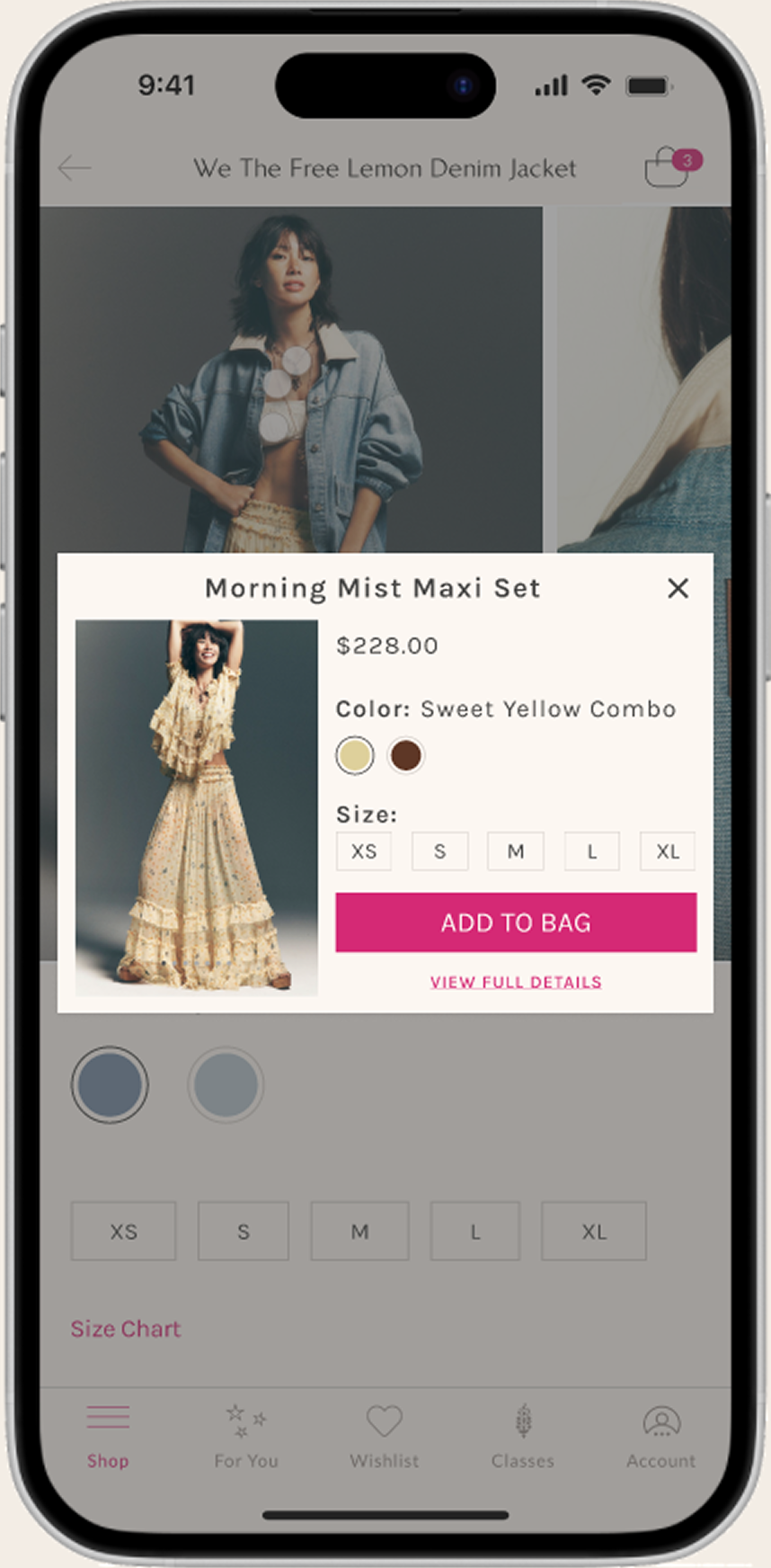
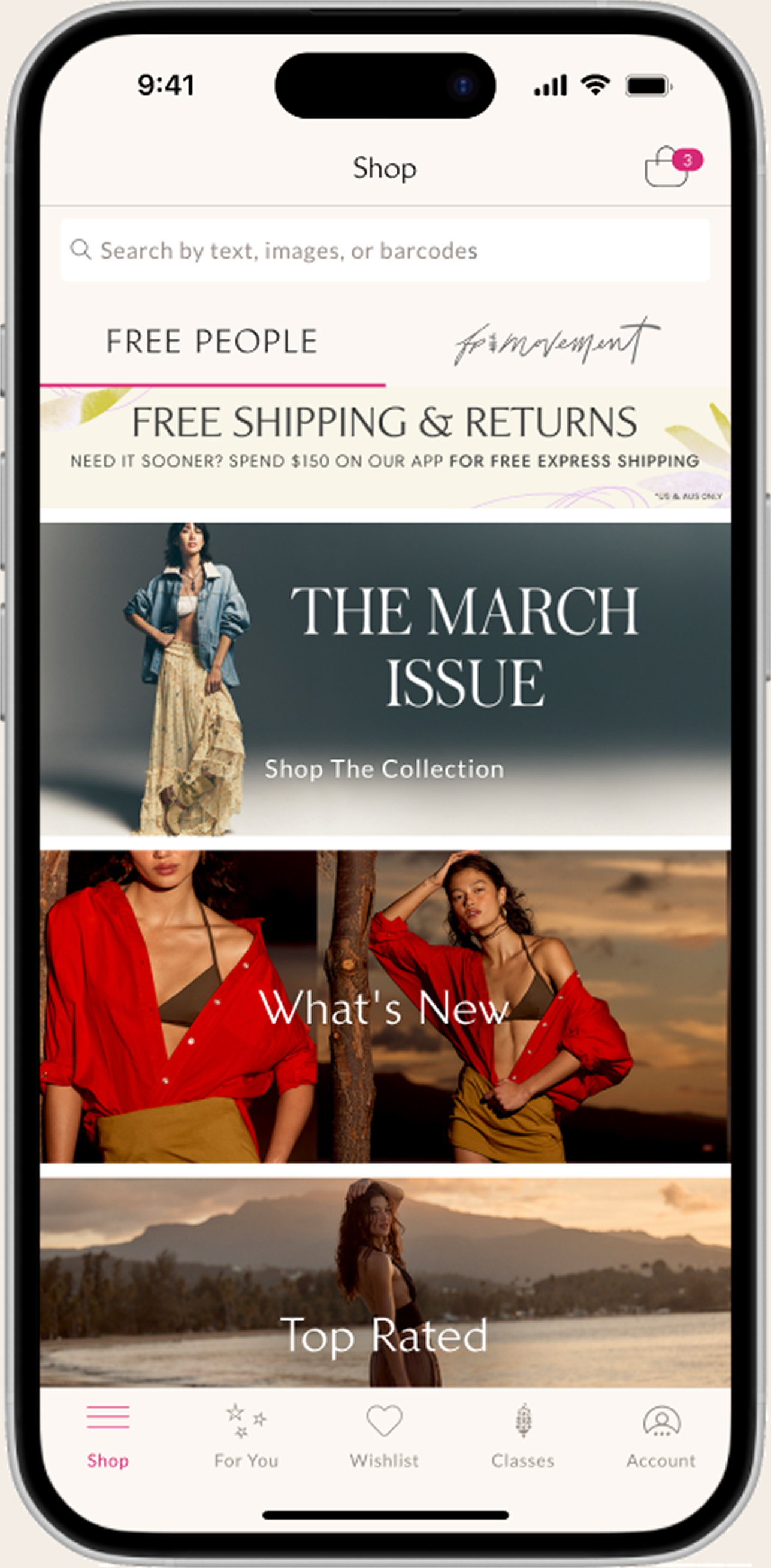
The journey begins when a user discovers a styled outfit in the homepage editorial content. Tapping 'Shop the Look' directs them to a curated collection featuring the Morning Mist Maxi Set, demonstrating how our visual merchandising drives product discovery. Users can easily identify all pieces shown in the styled imagery, addressing the common pain point of finding complementary items
Exploration
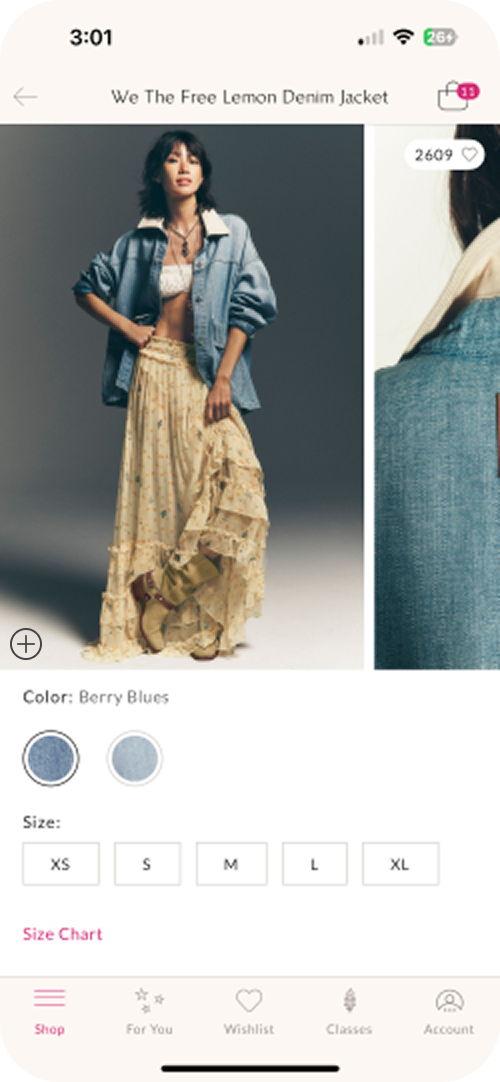
Upon selecting the denim jacket, users encounter the redesigned product view with enhanced imagery and the new high-visibility favorites toggle. First-time users receive a subtle tooltip guidance to highlight key features, helping them identify and utilize the shop the look functionality on first encounter. The interface clearly indicates which complementary items are available for immediate purchase.
Decision and Completion
The optimized product modal presents comprehensive information with improved layout and contrast, allowing users to seamlessly explore color options and size availability. When ready to proceed, selecting 'View Full Details' navigates them to the dedicated product page where they can access additional specifications and complete their purchase. This streamlined decision-to-purchase path maintains consistent context throughout the journey, enhancing the overall shopping experience.


When an item is unavailable in the user's selected style or color, the interface displays a "See Alternatives" call-to-action instead of the standard "Add to Bag" button. This proactive approach maintains shopping momentum by guiding users to similar products, reducing frustration and increasing the likelihood of completing their outfit purchase.
For items available in multiple sizes—such as pants or shoes—the design presents all size options in a horizontally scrollable layout. Users can easily browse and select their preferred size without navigating to a separate page. This consistent interaction pattern aligns with the existing XS–XL modal style, ensuring a cohesive experience across all product categories.
When items are completely out of stock, users see a clear modal indicating no matching products are currently available. Rather than ending the shopping journey, this message is paired with a prominent "See Alternatives" call-to-action that guides users toward similar style options. This approach transforms a potential dead-end into an opportunity for continued discovery and engagement.
Alternatives

Multiple Sizes

Unavailable Items

User Testing
User Testing
Usability Testing
Usability testing was conducted to validate the “Shop the Look” feature and identify areas for improvement, I conducted usability testing with 4 participants. Each user was guided through specific task flows designed to simulate real shopping scenarios. These tasks helped surface usability issues and uncover potential friction points within the interface.
In addition to task completion, participants were asked to share their opinions on both the appearance and functionality of the feature. This combination of behavioral observation and qualitative feedback provided a well-rounded understanding of how users experienced the design and where refinements were needed.
Feature Reception
The "Tap-to-Shop" and "Shop the Look" features were met with consistently positive feedback. Users found them intuitive, time-saving, and helpful—particularly appreciating the ability to interact with lifestyle imagery in a more meaningful way. Many mentioned that this feature eliminated the need to search manually or screenshot items to revisit later.
Users also responded well to the ability to shop multiple items from a single image. The modal design supporting this interaction was seen as useful, as it allowed users to maintain context without navigating away from the main feed.
Key Insights and Design Decisions
1. Modal Design & Readability
Insight: The original modal size was too narrow, cutting off critical product information and imagery.
Decision: Expanded modal width to span the entire screen, better accommodating product names and images while maintaining layout balance. This subtle adjustment significantly improved content clarity without disrupting the existing design structure.
2. Handling Unavailable Items
Insight: Gray placeholders for unavailable items were perceived as uninviting, with users expressing a desire for more visual context even for out-of-stock products.
Decision: Rather than removing the touchpoint entirely, we retained it to maximize product exposure. The gray placeholder was replaced with images of alternative options and a clear CTA directing users to similar products, creating a more engaging and informative experience.
3. UI Element Improvements
Insight: Small icons and low-contrast fonts reduced usability. User feedback highlighted the need for an explicit close button (X) at the top of modals and better functionality for exiting the modal via the darkened background area.
Decision: Increased font sizes for prices and color indicators, and enhanced icon visibility—especially in multi-item layouts.
4. Toggle Placement & Behavior
Insight: The feature toggle lacked sufficient visual prominence and was not easily discoverable.
Decision: Updated the toggle color to fuchsia to align with other interface elements and improve visibility. Additionally, implemented a subtle animation effect when users first land on the page to draw attention to the toggle's presence.
5. Visual Consistency
Insight: Inconsistencies in CTA button colors created visual confusion across the interface.
Decision: Applied consistent branding colors (e.g., fuchsia for primary CTAs) across all screens to reinforce familiarity and trust. Additionally, standardized modal behavior to ensure all modals appear in consistent locations throughout the experience.
6. User Behavior & Future Opportunities
Insight: Users frequently add items to their bag as placeholders for later consideration, not just for immediate purchases. There's also growing interest in social features like sharing or saving looks.
Opportunity: Future iterations could explore social shopping elements and saved/favorited looks to support ongoing browsing and engagement.
Changes Made


After
Before
The product favorites toggle was enhanced from a muted pink to a vibrant fuchsia color, creating visual consistency with other interactive elements throughout the application. Button opacity was increased to improve contrast ratios and enhance visibility for all users. These design refinements support our commitment to accessibility standards while maintaining brand aesthetics. The model's bracelet on her right wrist provides a clear example of how these color improvements impact the overall interface.
After
Before
The product detail modal was expanded to utilize the full screen width, improving content visibility and user experience. This strategic design update was implemented based on valuable feedback from a user with extensive experience in fashion e-commerce.
Key improvements include:
Addition of a prominent "X" close button in the top-right corner for intuitive navigation
Preservation of core product information with optimized spacing and layout
Maintained visual hierarchy while utilizing the expanded screen real estate effectively
This enhancement balances the need for comprehensive product information with a clean, uncluttered interface that simplifies the purchasing decision process.

After
Before
The product unavailability notification was redesigned based on comprehensive user research findings. User testing revealed that the previous gray "no longer available" messaging created negative emotional responses and disrupted the shopping experience. The updated design maintains continuity by immediately presenting alternative product recommendations within the same interface context. This solution allows users to view three relevant alternatives directly in the modal with an option to explore additional alternatives, reducing friction and maintaining engagement in the shopping journey.
Final Prototype
Final Prototype
Interactive Prototype
The final design is the result of several rounds of iteration, guided by thorough user testing and stakeholder feedback. Key improvements include a wider modal for better content display, clearer toggle visibility, consistent use of color, and a more intuitive way to handle unavailable products. The design balances user needs with technical feasibility, while staying visually aligned with the existing app's design system. Validation testing showed clear improvements in task completion and user satisfaction.
In addition to these changes, I also refined spacing, cleaned up component alignment, and simplified interactions to make the feature easier to use. These updates improved both the overall functionality of the prototype and the visual clarity of the final solution.
Click the image or button below to explore the live prototype.
Web Prototype

This feature translates seamlessly to the desktop experience by integrating with the existing quick shop modal. Interactive markers are placed directly on the individual clothing items within the product image, and the same toggle switch is added to the top-left corner. This allows users to turn the feature on or off, similar to the app functionality. Users can still enjoy the benefit of shopping the entire look while maintaining a cohesive experience aligned with the website’s visual style.

Implementation
A phased rollout approach will be executed to ensure optimal user adoption and feature performance. The implementation plan includes:
User Communication: A targeted email campaign will introduce the enhanced features to existing users prior to launch, creating awareness and setting expectations.
Progressive Education: An initial onboarding modal will highlight key improvements for all users during the first three months post-launch. After this period, the educational component will transition to appear only for new user onboarding.
Continuous Optimization: The design will undergo further refinement based on quantitative metrics and qualitative feedback gathered during the expanded user trial. This data-driven approach ensures the feature evolves to best serve our specific user demographic.
Performance Monitoring: Analytics will track engagement metrics with particular focus on modal interaction patterns, alternative product selection rates, and conversion impact to validate design decisions.


Future Considerations
Future Considerations
In an ideal scenario, further user testing would be conducted to refine the details of each phase of the design. Continued feedback will help identify usability issues and ensure the feature evolves to meet user needs effectively.
This feature is intended to be iterative—regular monitoring and updates based on user behavior and insights will be key to its long-term success.
There are several opportunities for future improvement:
Marker Visibility: Adjust marker colors dynamically to maintain contrast with the image underneath, enhancing visibility and accessibility.
Product Styling: Photograph outfits that strategically highlight key items or bestsellers. Ensuring that only in-stock or store-available items are featured on models can help manage user expectations and improve conversion rates.
Modal Consistency: Standardize the way products are photographed in pop-up modals to create a cohesive visual experience. This consistency will help users feel more confident and oriented as they browse the app.
Measuring Success:
The impact of this feature will be measured through key performance indicators such as:
An increase in purchases initiated through the interactive modals (e.g., a target uplift of 15–20%).
Growth in the average number of items per cart, with a goal of increasing by at least 1–2 items per transaction.
A reduction in bounce rate on product detail pages accessed via the modals. These metrics will help determine how effectively the feature is driving engagement and conversions.