Tap in - hangout app
connect with friends through low stakes spontaneous hangsProject Background
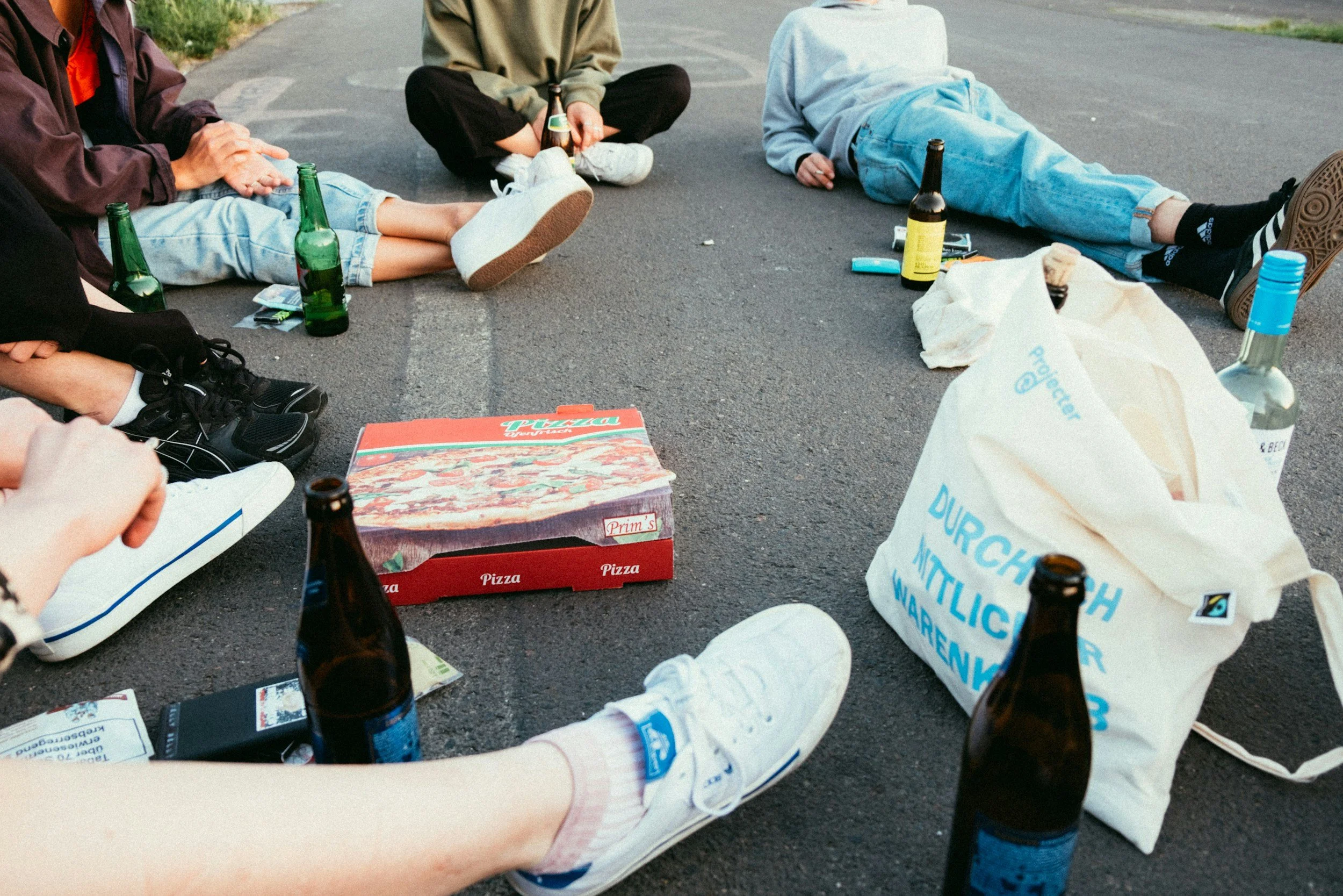
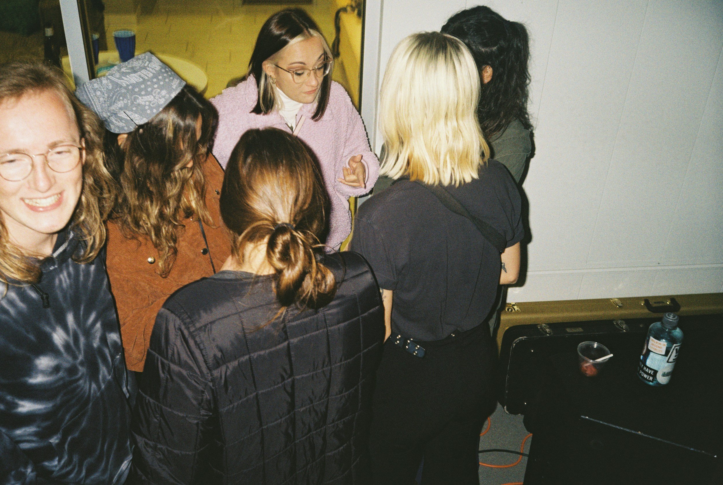
Young adults often find that making spontaneous plans with friends is harder than it should be. Multiple texts, scheduling conflicts, and the emotional effort of coordinating can turn a casual meetup into a chore.
This is especially true for people in their 20s and 30s, a group facing rising rates of loneliness, who often don’t know they’re free until the last minute. In my own friend group, I noticed how last-minute plans unintentionally excluded people — not because they weren’t wanted, but because reaching out to everyone individually felt overwhelming.
Tap In removes these barriers by letting users casually broadcast availability or browse low-key plans nearby — without the pressure of a formal invite. With lightweight group sharing, real-time visibility, and privacy-aware controls, the app helps people connect naturally in the moment, making spontaneous socializing effortless again.
Note: This project was created as a student concept for educational purposes and is not affiliated with any existing platform.
My Role
As the sole designer, I led the project from concept to usability testing. My responsibilities included:
Conducting user research to uncover needs, motivations, and barriers to spontaneous hangs
Designing both interaction and visual elements to ensure the feature was intuitive and engaging
Building interactive prototypes to test and refine key features
Running usability tests to improve functionality, accessibility, and overall experience
Each design decision was grounded in user insights, allowing me to strengthen my UX/UI skills while creating a product rooted in empathy and usability.

Scope
User Research – Identifying user needs and challenges in posting and joining group hangs
UX/UI Design – Creating an intuitive interface aligned with the app’s style and accessible to new users
Branding – Developing the brand identity, including colors, fonts, logo, and visual style to ensure a cohesive and engaging experience
Prototyping – Developing interactive prototypes for testing and iteration
Usability Testing – Gathering and applying feedback to refine the experience
Timeline
April 2025 - July 2025 (3 months)
Part-time, 15 hours /week

Table of Contents
Table of Contents
Introduction
Introduction
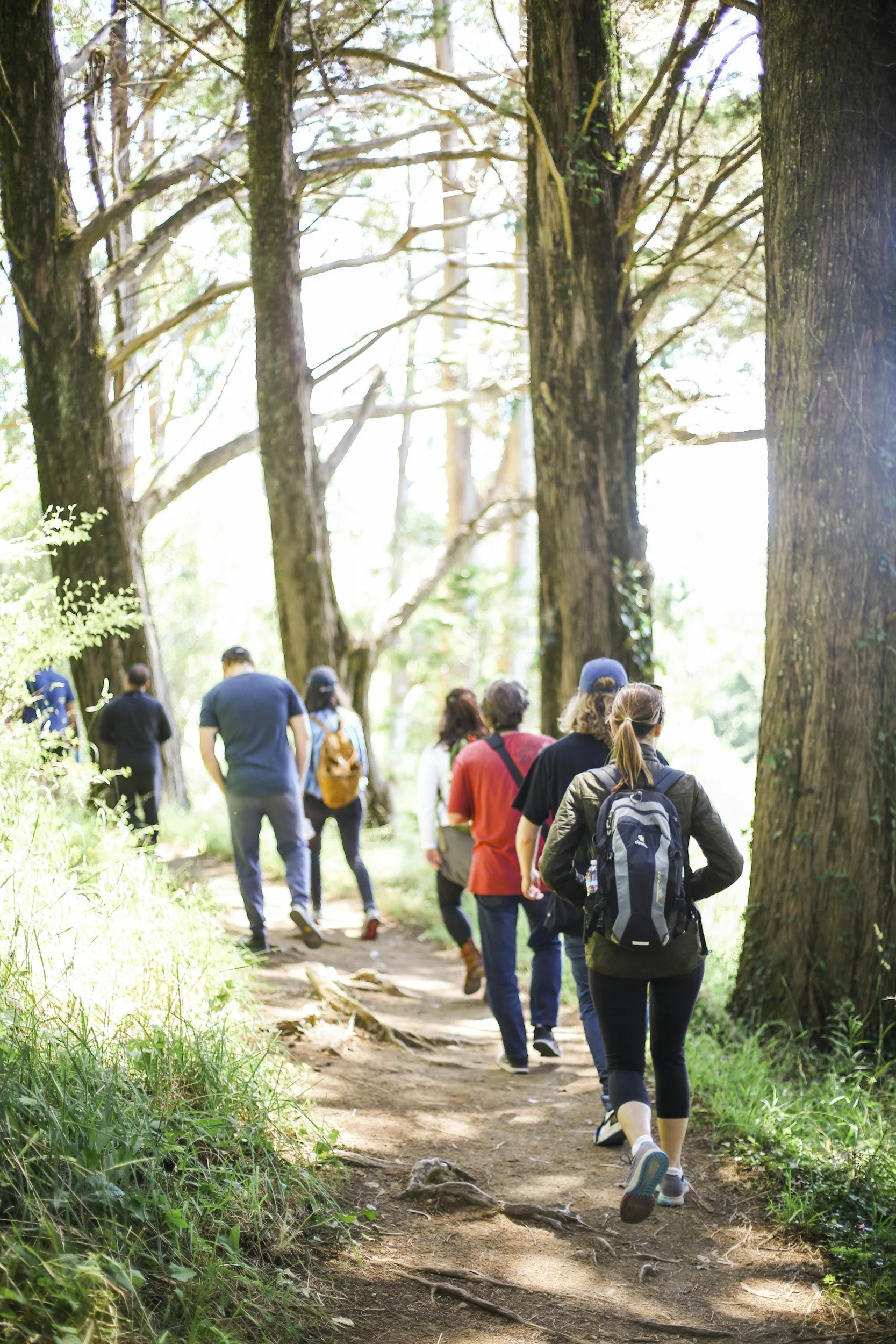
Problem
Young adults often want to hang out casually with friends but face unnecessary friction when trying to make spontaneous plans. Existing social platforms tend to focus on structured events or group chats, making it difficult to quickly see who’s available or share informal availability. This lack of low-effort social coordination leads to missed opportunities for connection and contributes to feelings of isolation.
Solution
The Tap In app addresses these challenges by offering a lightweight, availability-based feature designed for casual, real-life connections. Key aspects of this solution include:
Enabling users to post low-effort plans with just a few taps
Allowing friends to browse nearby hangouts or send invites without individually messaging everyone
Supporting selective sharing with different friend groups for personalized connections
Removing RSVP pressure by eliminating visible “no” responses and formal event structures
By replacing group texts and rigid planning with a flexible, social feed, Tap In lowers the barrier to spending time together. Users can connect spontaneously—whether grabbing coffee, taking a walk, or simply hanging out. The design emphasizes a fun and informal experience while respecting users’ social energy, privacy, and spontaneity.

Background Research
Background Research
The COVID-19 pandemic has had lasting effects on social behavior, particularly among aging adults. According to research from CU Boulder, over half of older adults continue to spend more time at home and less time socializing publicly compared to pre-pandemic times. This shift has significantly altered neighborhoods and daily routines, with potential long-term impacts on physical, mental, social, and cognitive health. The loss of spontaneous social interactions, especially in informal “third places,” raises concerns about increased loneliness and wellbeing.
“Years after the U.S. began to slowly emerge from mandatory COVID-19 lockdowns, more than half of older adults still spend more time at home, and less time socializing in public spaces than they did pre-pandemic, according to new CU Boulder research.”
“We found that the pandemic fundamentally altered neighborhoods, communities and everyday routines among aging Americans, and these changes have long-term consequences for their physical, mental, social and cognitive health,” said Finlay.
“Still, Finlay worries that the loss of spontaneous interactions in what sociologists call “third places” could have serious health consequences.”
On the user behavior side, studies suggest that 20% of users typically create 80% of hangouts (Pareto Principle). Founders building hangout apps for the past two decades have often struggled to succeed due to common barriers: forgetfulness, psychological hurdles, and inconvenience in reaching out.
“20% of users will create 80% of the hangouts (Pareto Principle).”
“Founders have been building hangout apps for the last 20 years, and we’ve failed every single time, except for once.”
“- these three problems with reaching out: forgetfulness, psychological barriers, and inconvenience.”
Competitor Analysis
I analyzed several existing hangout apps to identify strengths, weaknesses, and opportunities to differentiate
Emit: Spontaneous Hangouts 12+

Target: College-aged users
Features: Suggested activity prompts, friend group segmentation, feed-style event display
Insights: Prompts help overcome indecision; friend groups improve privacy control; playful UI influences perceived polish and credibility.
PAX - Spontaneous hangouts 17+
Target: Young adults seeking casual plans
Features: In-app chat, spontaneous event browsing, filters by cost/time/location
Insights: Quick chat supports coordination but must preserve spontaneity; filters improve relevance but can lead to over-planning; local event surfacing boosts utility.
Circle: Meetups with friends
Target: General friend groups planning small gatherings
Features: Location-based discovery, real-time updates, polls for group decisions
Insights: Geofencing aids practicality; polls can slow decision-making; live chat keeps groups aligned for last-minute meetups.
Partiful
Target: Users planning social events across platforms
Features: Multi-platform invite sharing, event templates, guest tools (RSVP, payments)
Insights: Platform-agnostic sharing increases reach; branding features add fun and personality; app leans toward formal planning, less suited for spontaneous hangs.
Opportunity Areas for Tap In
Low-Effort Social Broadcasting
→ Competitors still focus on structured event planning. Tap In can stand out by letting users casually broadcast availability or vibes without commitment.Selective Sharing by Default
→ While some apps support group targeting, Tap In can make friend-group filtering a core feature, ensuring users never feel they’re broadcasting to everyone.Lightweight Coordination Without Commitment
→ Unlike chat-heavy apps, Tap In can emphasize non-verbal coordination (reactions, interest buttons, casual RSVPs) to reduce social pressure and keep things fun.Design for Vibe Over Structure
→ Instead of planned parties, Tap In can focus on spontaneous, relaxed hangouts like “walk?” or “porch beers?” — prioritizing social energy over event formality.Spontaneity-First Discovery Feed
→ Tap In could combine user-generated availability posts with ambient context (weather, time of day) to surface the right kind of hangouts at the right moment.Polished Yet Playful Aesthetic
→ Tap In can fill the gap between playful but less polished interfaces and overly formal ones, delivering a refined yet approachable look that appeals to older Gen Z and millennials.
User Research
User Research
User interviews
To gain a deeper understanding of my target users, I conducted six remote interviews via Google Meet with participants in their 20s and 30s. Each session lasted 45 to 60 minutes and was structured in two phases:
Persona-building: Explored participants’ social habits, attitudes toward spontaneity, and common challenges when trying to hang out.
Feature feedback: Gathered user reactions to proposed app features, assessing clarity, appeal, and usefulness of early design concepts.
Key discussion topics included how participants currently coordinate plans, their comfort level with last-minute hangouts, decision-making factors for joining events, and thoughts on features such as RSVP systems, notifications, and selective event sharing.
Affinity Mapping
After the interviews, I synthesized insights using affinity mapping, grouping observations into thematic clusters. This process revealed important patterns that directly influenced design decisions:
Information needs:
Users want quick, scannable details to make fast decisions—specifically around time, location, cost, and group size.
Hang Preferences:
Participants prefer low-commitment, flexible activities they can join or leave easily, rather than rigid or highly structured events.
Social Behavior Patterns:
Current coordination methods create friction around sharing availability and gauging group interest.
Notification Control:
Excessive notifications and group messages overwhelm users and lead to disengagement.
Essential Event Details:
Successful hangout posts consistently include activity type, duration, location accessibility, and flexible participation options.
These insights directly informed features like share templates for easy posting, time constraints that support flexible attendance, and customizable notification settings. The affinity mapping helped prioritize solutions focused on reducing social friction while preserving the spontaneous, low-pressure vibe users desired.
interview Takeaways
User Motivations & Feature Preferences
Spontaneous Socializing
Users want low-effort, low-commitment ways to hang out, usually same-day or next-day.
More likely to accept casual activities (grocery runs, walks) than big scheduled events.
Invites should feel light, flexible, and pressure-free.
Clear Information Needed Upfront
Activity description and mood/vibe tags
Time and location details
Cost estimates or price ranges
Group size and attendee list
Transportation/parking info
Privacy & Social Controls
Friend-only vs. public event filters
Attendee limits and resharing controls
Customizable decline responses with context
Option to hide who declined to avoid discouragement
Friends-of-friends sharing restrictions
Dual Feed Structure
Separate feeds for friend-initiated hangs and public/business events
Friend hangouts are primary; business events are secondary
Short-Term Planning Focus
Ideal plan timeline is today or tomorrow; anything further feels excessive
Users want a simple feed, not full calendars
Events sorted chronologically (soonest first) for easy browsing
Quick Access & Notifications
Real-time notifications with countdown timers (e.g., “25 minutes to join”)
Customizable notifications by distance radius and friend groups
Banner-style alerts preferred over emails
Event-Specific Group Communication
Temporary group chats auto-deleting 24–48 hours after events to avoid clutter
Linked directly to event RSVPs, not separate messaging apps
Options to save important memories or photos
Smart Response Systems
Simple RSVP options: Yes / Maybe / No, with optional decline context
Pre-filled polite decline responses (e.g., “Busy tonight, try me next time”)
Display RSVP counts without showing who declined
Interview Insights
Haylee – The Frequent Casual Socializer
Haylee values efficiency and prefers small group hangouts of 3–4 people for easier coordination. She averages one weekday hangout per week, with more on weekends. Casual activities like dining, drinks, coffee, and vintage shopping are her go-to. Large groups frustrate her due to coordination difficulties across friend circles. She prefers instant access to key event details—activity, cost, and location—with minimal friction.
CHLOE - THE SELECTIVE WEEKEND SOCIALIZER
Chloe takes a curated approach, attending 2–4 hangouts weekly, mostly on weekends. She favors chill weekday activities (dinner, watching games) over active weekend plans. Her ideal group size is 3–4 people, mixing one-on-ones and group hangs. Chloe values quick, efficient notifications with clear details and desires strong privacy controls and attendee limits.
ADAM - THE SPONTANEOUS ENTHUSIAST
Adam thrives on last-minute, low-pressure social opportunities. He likes spontaneous hangouts with as little as 30 minutes’ notice and less than a day lead time. Casual meetups like walks, beach trips, or TV watching appeal to him. He enjoys reposting community events to his friend groups and wants features such as timed notifications, group photo sharing, location-based discovery, and personalized recommendations.
RUTH - THE INFORMATION-DRIVEN PLANNER
Ruth needs detailed information before committing to social activities. She uses WhatsApp for last-minute plans but would adopt an app for more organized events. She highly values RSVP counts, mutual interest alignment, and full event details (date, time, location, cost). Past experiences with low engagement have made her hesitant to post events, though she remains interested in discovering community events.
ALYSSA - THE RESPONSIVE PARTICIPANT
Alyssa tends to respond to plans rather than initiate them. She’s open to last-minute invites, with an 80% acceptance rate for events under $100 and 2 hours’ notice. She typically attends 1–3 hangouts per week lasting 3–4 hours. Alyssa prefers small groups (1–3 people), values simplicity, flexibility, and having just enough information to quickly decide whether to join.
Persona
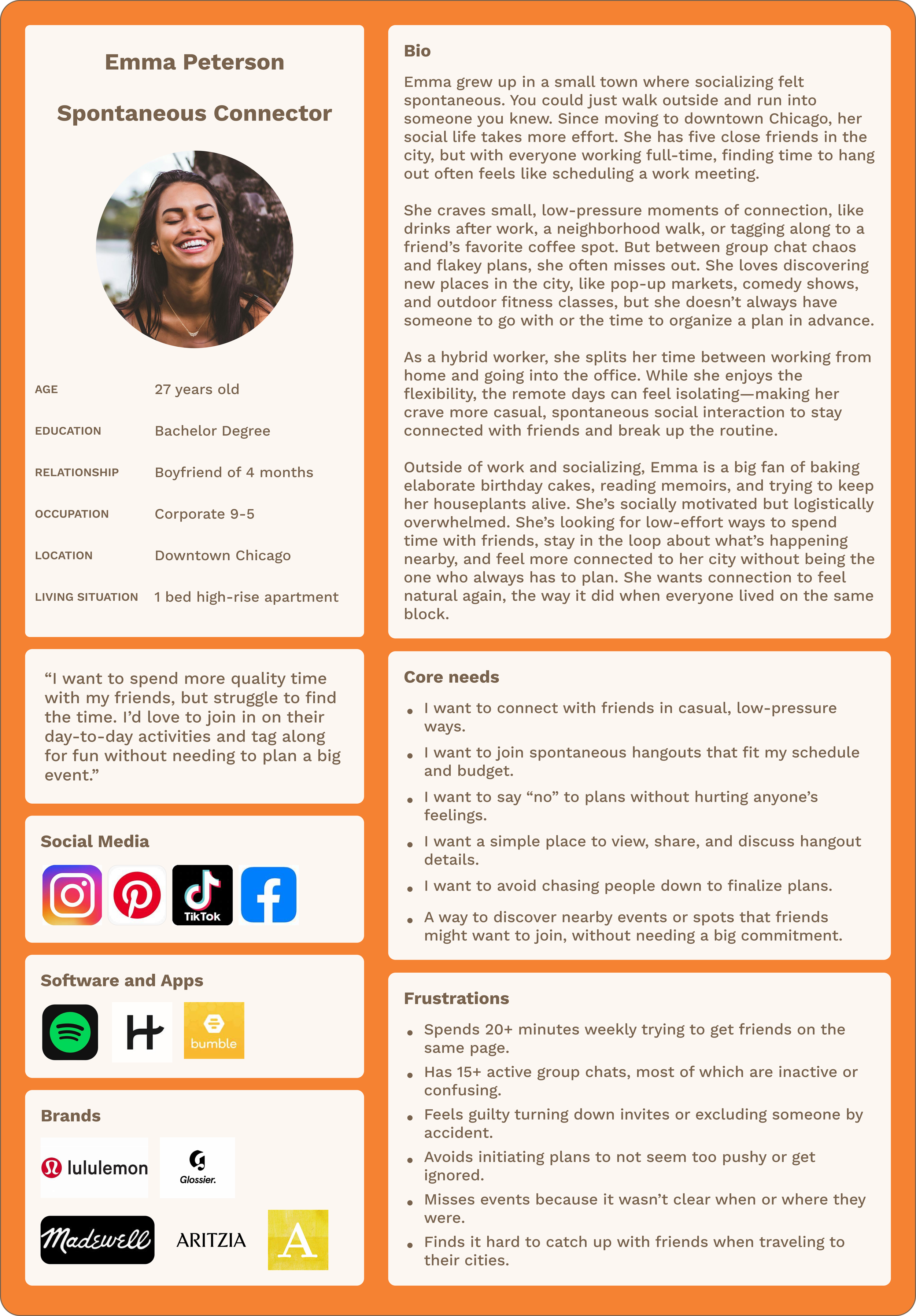
TARGET AUDIENCE
Emma represents the ideal user for Tap In, based on insights from user interviews and market research conducted throughout this project. She is a socially motivated young adult in her late 20s living in a city, working a hybrid corporate job, and experiencing the common challenge of coordinating casual time with friends. Although tech-savvy and active on social apps daily, Emma is overwhelmed by group chat overload and last-minute confusion.
Emma craves low-pressure, flexible ways to stay connected and engage in everyday moments without the stress of detailed planning or full event commitments. Her lifestyle and digital fluency make her a perfect fit for Tap In, an app designed to foster spontaneous connection, selective sharing, and lightweight social interactions.
FEATURE ALIGNMENT
Emma frequently finds informal hangout coordination challenging—whether it’s joining friends for a walk, grabbing coffee, or checking out a local event. Tap In directly addresses these pain points by allowing her to casually broadcast her availability, browse nearby hangouts, and interact with friends without the need to initiate a major plan. The app removes the frustration of scrolling through inactive group chats and feeling guilty about declining invitations.
Tap In empowers Emma to “tap in” organically when the timing feels right, with no pressure or hassle.
DESIGN CONSIDERATIONS
While Emma embodies the primary target demographic, feedback from a broader group of users, especially women interested in spontaneous plans with varying comfort levels around new social technology, helped shape the design.
Tap In balances Emma’s digital fluency with an intuitive interface and optional onboarding, making the experience approachable for more casual users. Features like friend group filters, low-stakes RSVP options, and flexible sharing prioritize social comfort and ease of decision-making, reflecting real behaviors and preferences uncovered during early research.
Problem Statement
Emma has a hard time connecting with friends because reaching out and making plans has become too complicated. She wants to be able to connect with her friends through more spontaneous and lower-stakes hangouts.
💡 insights
-
⚙️ How Might We’s
How might we make the app intuitive so new users don’t find the learning process intimidating?
How might we create groups so users can control who sees their event?
How might we help introverted users feel comfortable saying yes to plans and contributing?
How might we give users more control over sharing and encourage deeper conversations?
How might we allow users to post to groups without pressure or awkwardness?
🔍 Needs
A display showing hangouts with relevant friends and group context
Private friend groups for targeted invites
Mood tags and hangout types that accommodate different energy levels
Clear guest lists and filters to set social expectations
The ability to control who can reshare the event
-
⚙️ How Might We’s
How might we support small group discovery and suggest mutual connections?
How might we provide group cues or simple ways for users to start plans?
How might we send invites or show friend availability in real time?
How might we encourage quick replies to invitations?
🔍 Needs
A feed filtered by shared interests and availability
Easy-to-use templates for proposing hangouts
Lightweight RSVP tools and live availability status where users can block off unavailable times
Countdown timers or soft deadlines to confirm plans
-
⚙️ How Might We’s
How might we surface relevant local events or casual meetups?
How might we create simple tools to track and confirm plan details?
🔍 Needs
A curated local feed of events and low-effort activities
A clean, structured RSVP system that doesn’t rely on chat
-
⚙️ How Might We’s
How might we create a feed of current events and foster a culture where users feel safe posting?
How might we highlight users with shared events and places as cues for hangouts?
How might we encourage repeat app use and regular engagement?
How might we help new users understand and use the app’s social features through clear onboarding?
🔍 Needs
Privacy and visibility controls for social posts
Smart overlap detection of friends’ activities
Notifications when friends create events
Prompts that inspire users to create their own events
Simple onboarding that highlights both active and passive social tools
-
⚙️ How Might We’s
How might we help users feel comfortable re-engaging with old contacts?
How might we support reconnecting with dormant friendships through gentle prompts?
🔍 Needs
Features that reduce awkwardness and make re-entry feel natural
Subtle prompts encouraging reconnection without pressure
Project Goals
User Goals
Spend more time with friends
Easily maintain connections with friends through different phases of life
Attend more activities in their area
Get outside more often
Minimize planning time for last-minute events
Hang out easily with friends and meet people when visiting different cities
Discover local events, activities, and places
Build meaningful relationships and connections
Maintain privacy and control over personal information
Personalize their social experience based on interests
Shared Goals
Consistently use the app to coordinate and hang out with friends
Feel safe using the app and sharing their location
Meet new people and add them to their network to increase friend connections
Build trust and positive experiences within the community
Facilitate smooth coordination through messaging and planning tools
Create engaging social experiences that bring value to all participants
Business Goals
Increase the number of users on the app
Find ways to monetize the app without user ads or by having businesses pay to join
Expand to different cities
Appeal to all different age groups
Improve user retention and long-term engagement
Collect data to enhance matching algorithms and user experience
Build network effects where more users create more value
Develop partnership opportunities with local businesses and venues
Establish sustainable revenue streams
Initial Prototyping
Initial Prototyping
feature set
Drawing from user interviews and competitive analysis, I created a feature prioritization matrix that balances user value with technical complexity. This roadmap focuses on solving core coordination problems first, with "nice to have" and "delightful" features planned for subsequent releases based on user adoption and feedback.
Priority 1:
Must Haves
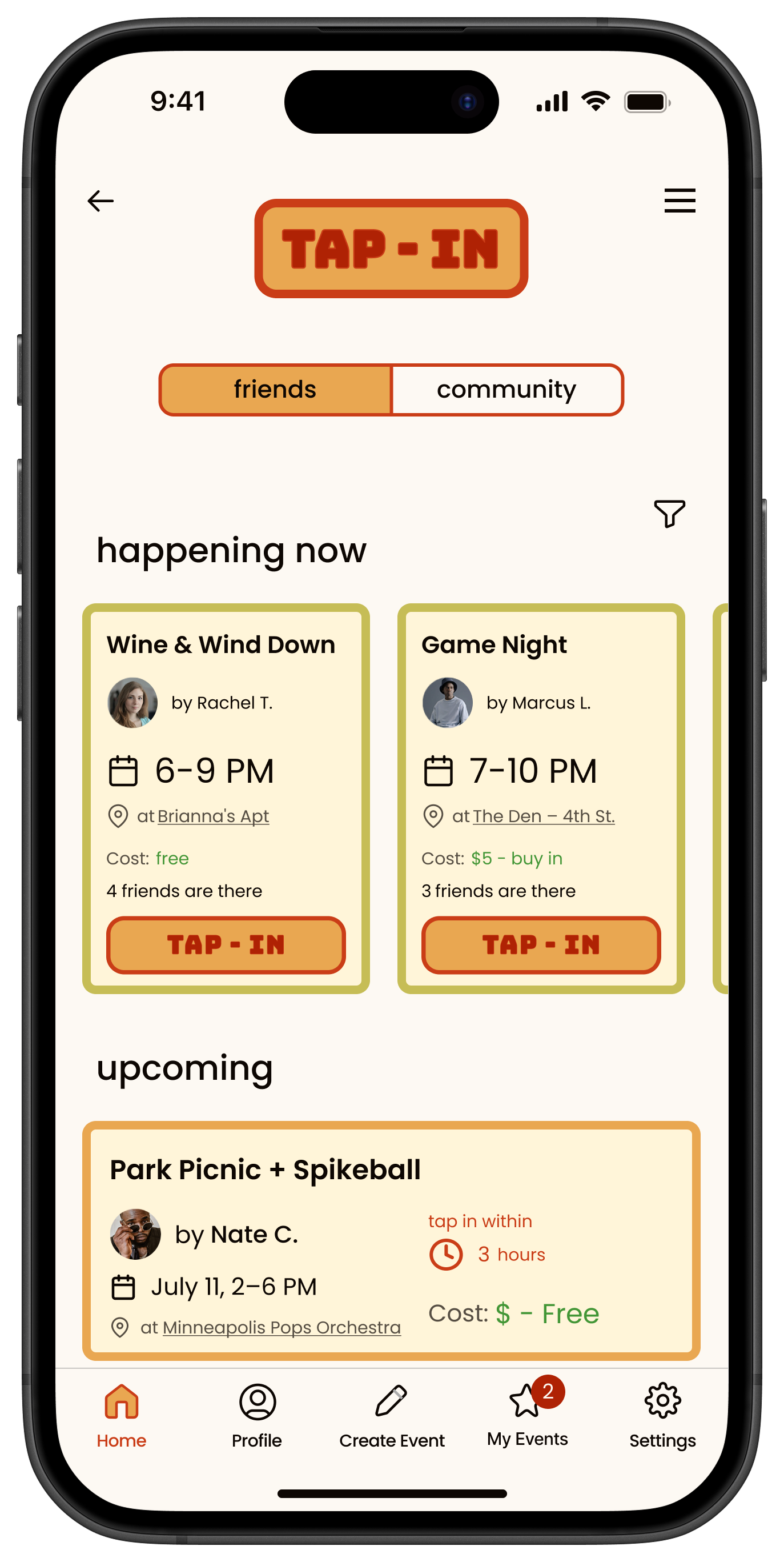
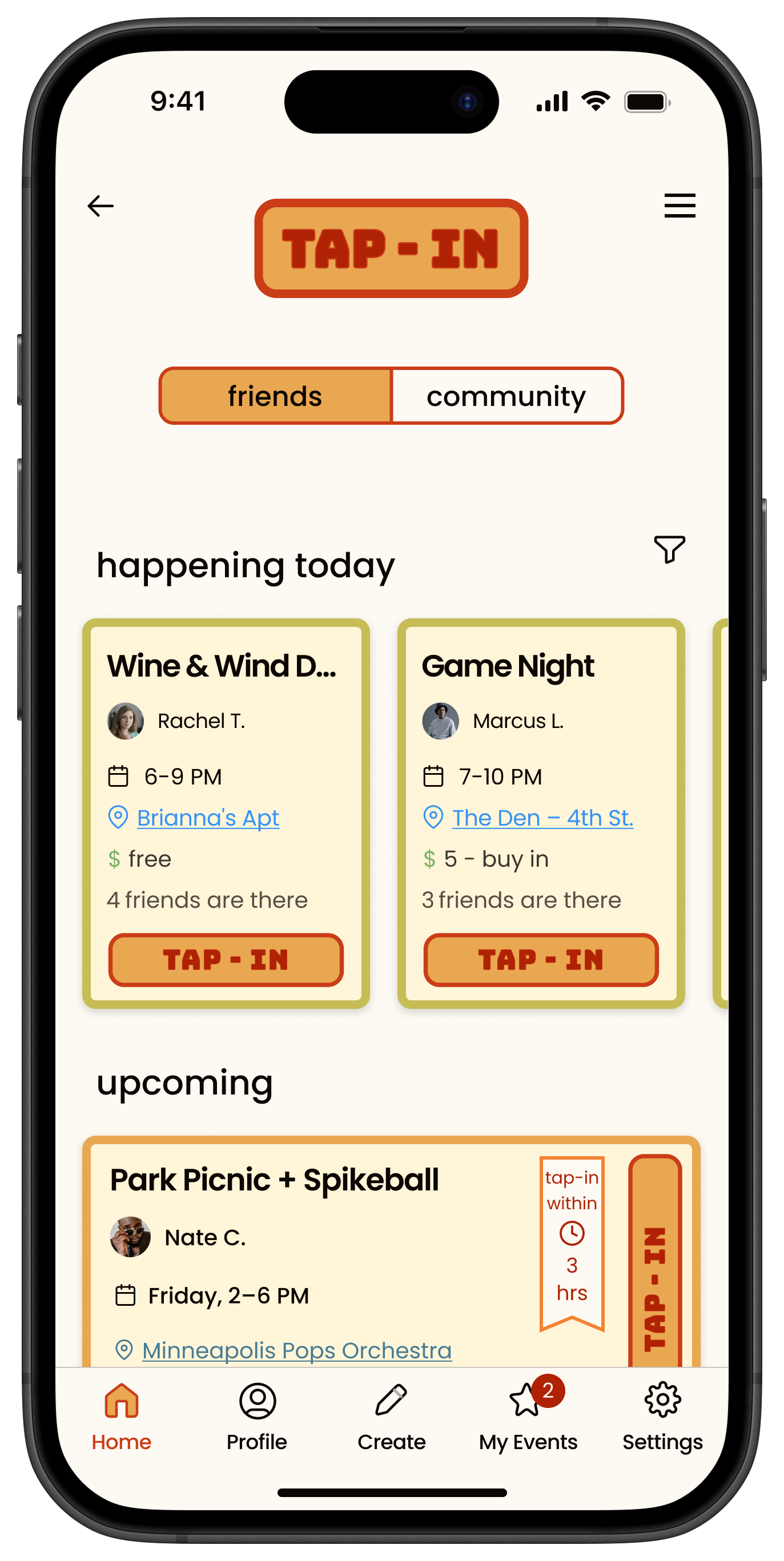
Friend vs. Business Feed
Toggle between feed of friend posts and curated local events from businesses.
Messaging Center
Group chat created for each event and then dies along with the event.
Priority 2:
Nice to Have
Archived Events
Let users save old events and their conversations for future reference.
Local Business Pages
Concert Venues or local event planners can create events to be reshared.
Priority 3:
Surprising and delightful
Wrapped / Year in Review
Summary of user's hangouts: top friends, most common activities.
Priority 4:
Can come Later
Personality Metrics
Use behavior to build a profile and recommend future events or people.
Site Map
I developed a comprehensive site map to establish the app's information architecture and core user flows. This foundational step allowed me to map out essential features, prioritize navigation pathways, and ensure all key user needs identified during research were addressed in the app structure.
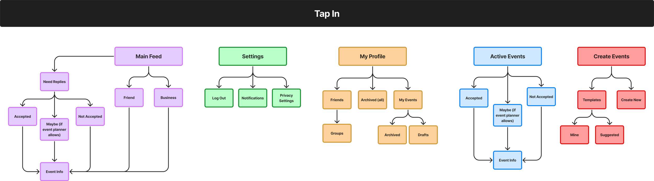
Low Fidelity
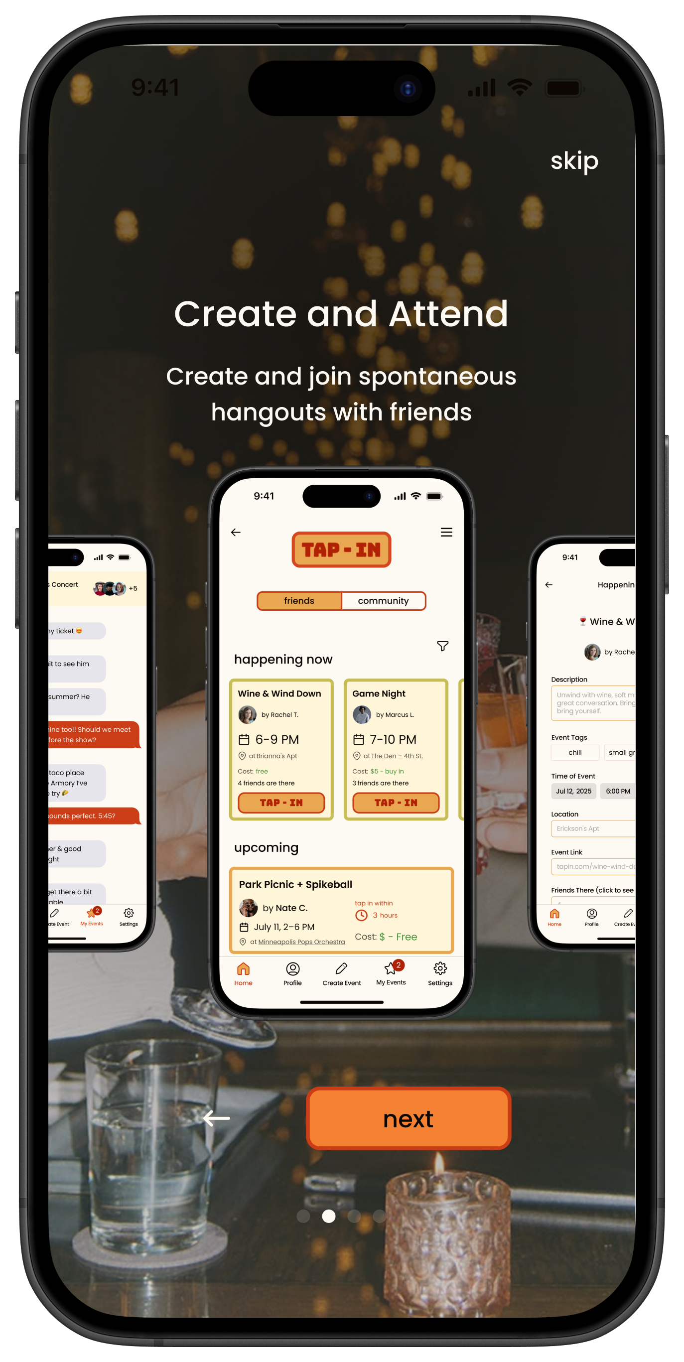
These initial wireframes focused on the core user journey: discovering nearby hangouts, making quick decisions, and lightweight coordination. Key design principles included minimizing steps to post events, surfacing essential information for fast decision-making, and creating social context without overwhelming users.
Early wireframes prioritized familiar interaction patterns while introducing new concepts like "tapping in" and selective friend group sharing. This exploratory phase helped validate information hierarchy and interaction models through rapid user feedback sessions.

Branding
Branding
Branding and Logo creation
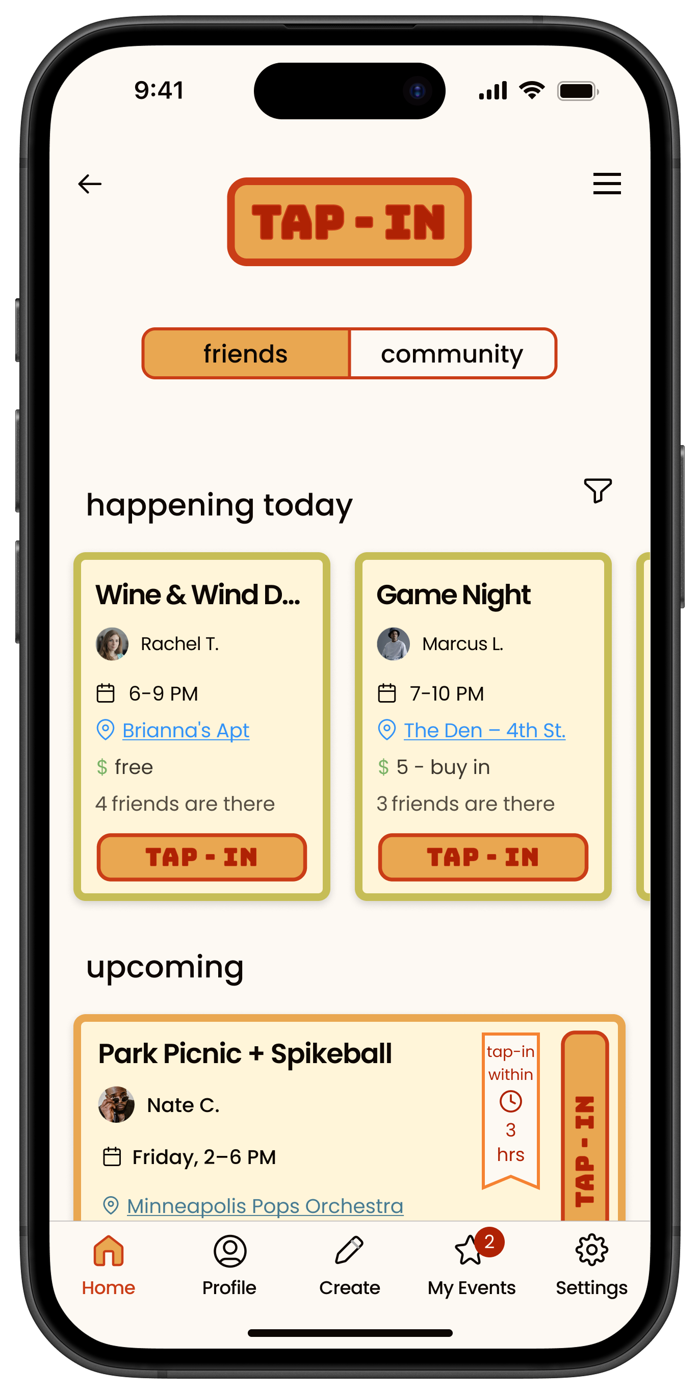
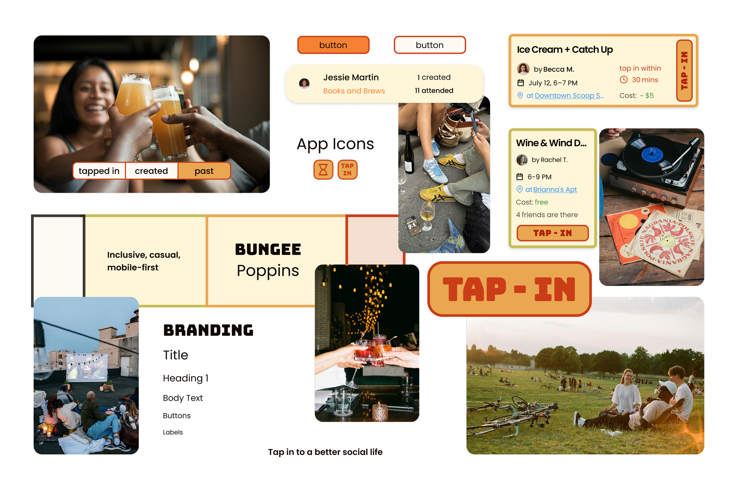
For Tap-In's visual identity, I developed a warm, inviting color palette centered around yellows, oranges, and greens to evoke feelings of approachability and casual connection. This nostalgic color scheme balances retro charm with contemporary usability, creating an atmosphere where users feel comfortable engaging with spontaneous social opportunities.
The color system serves both functional and emotional purposes: green indicates "happening now" events (like a go signal), yellow represents upcoming events (mimicking a stoplight), and the bright, warm tones evoke happiness and excitement about hanging out with friends. I used a light butter yellow as the primary background to ensure readability while letting the brighter, more defining colors serve as accents and interaction cues.
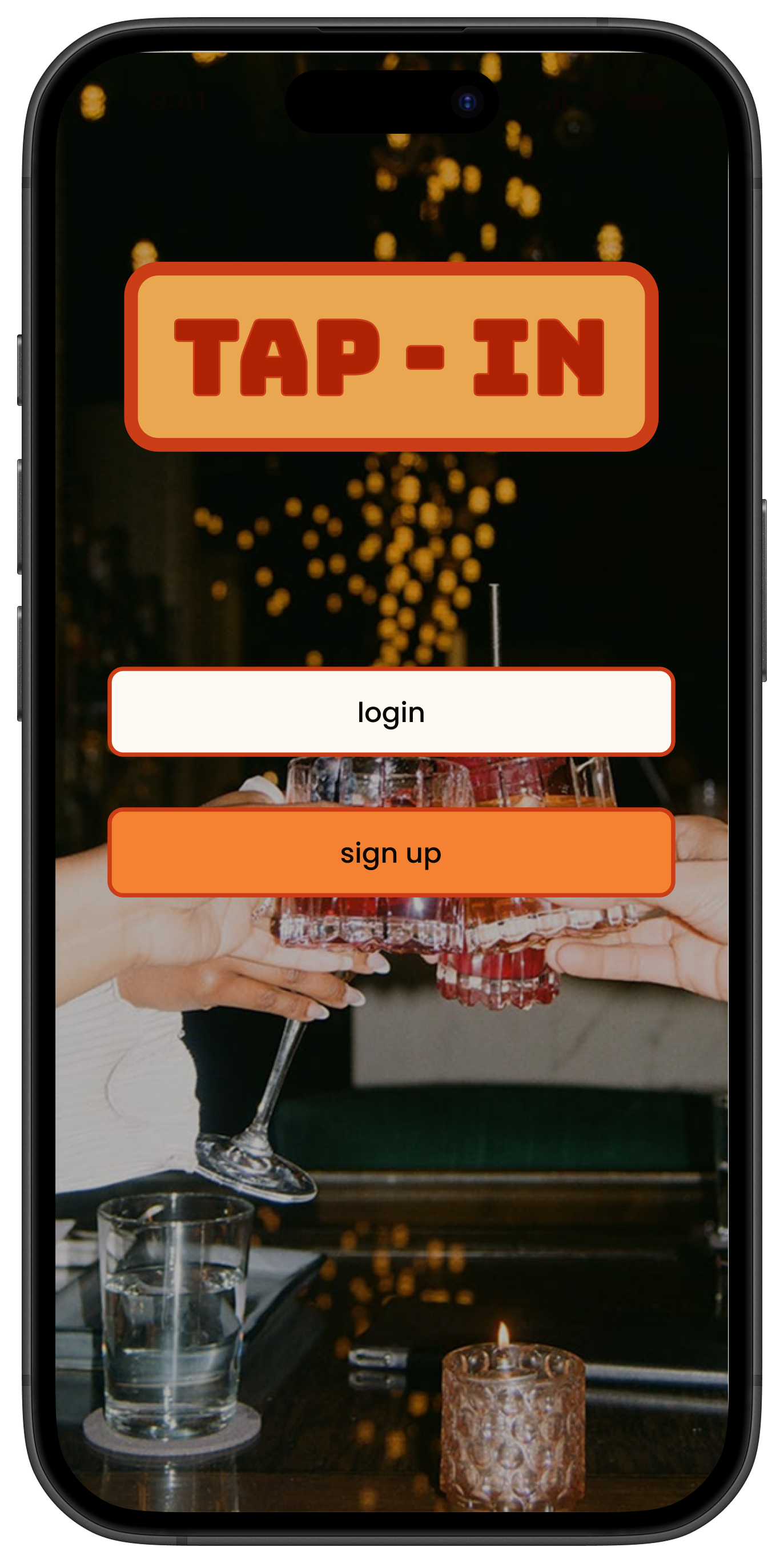
Initially, I experimented with different logo concepts, including a horizontal "TAP IN" layout within an hourglass shape to represent time sensitivity. However, this design looked too similar to the clothing brand TapouT, so I decided to remove the horizontal hourglass. Ultimately, I decided to make the logo identical to the primary action button—creating a cohesive brand experience where the logo itself becomes the main call-to-action users interact with throughout the app.
The design prioritizes content over interface elements, allowing event photos and user interactions to take center stage. This integrated approach means the "TAP-IN" button serves simultaneously as brand identifier and functional element, creating a seamless connection between brand recognition and user action.
Usability Testing
Usability Testing
Testing insights and revisions
This round of usability testing focused on improving Tap In's clarity, functionality, and overall user experience as it evolved from low-fidelity wireframes to mid-fidelity prototype. I conducted 5 moderated remote sessions (30 minutes each) where participants completed task-based scenarios including navigating the app, creating events, interacting with RSVP features, and using social tools. Testing used a semi-functional prototype with screen sharing to allow participants to navigate key user flows. The goal was to uncover usability pain points, assess visual hierarchy, and improve decision clarity before moving into high-fidelity design.
Key Insights & Feedback Themes
and Revisions Made
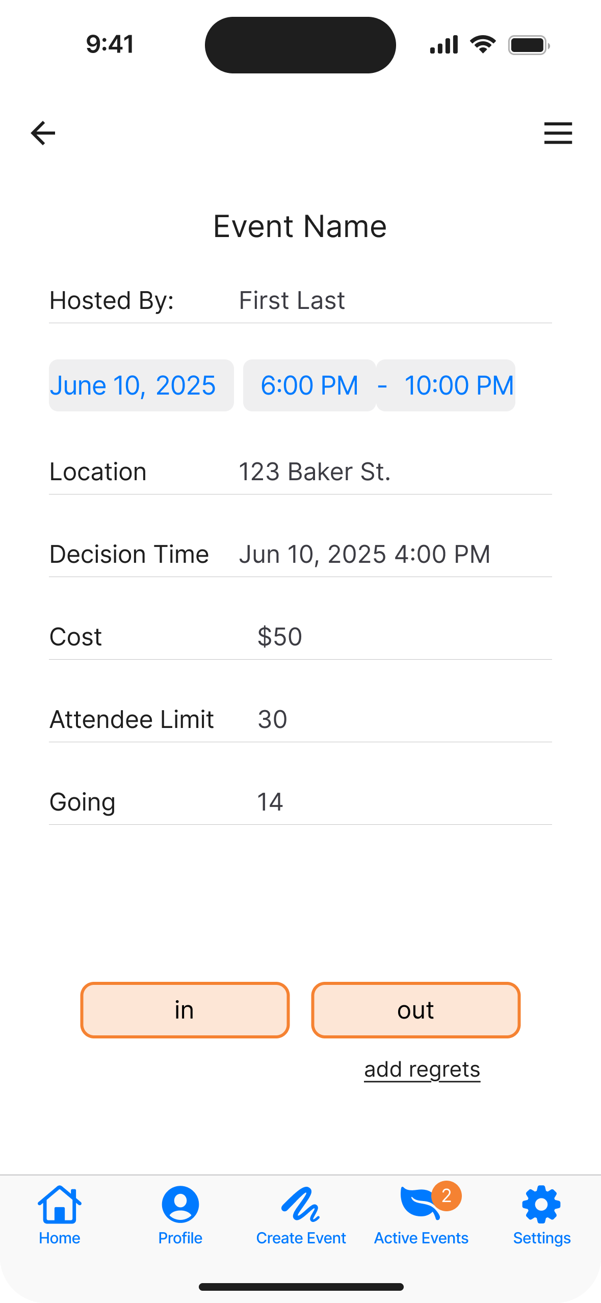
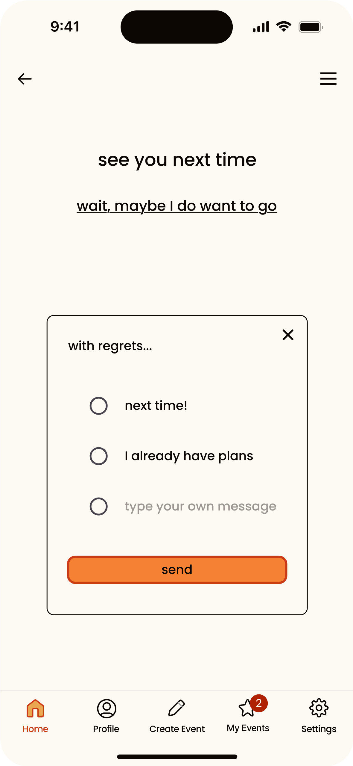
1. Event Interaction & RSVP Flow
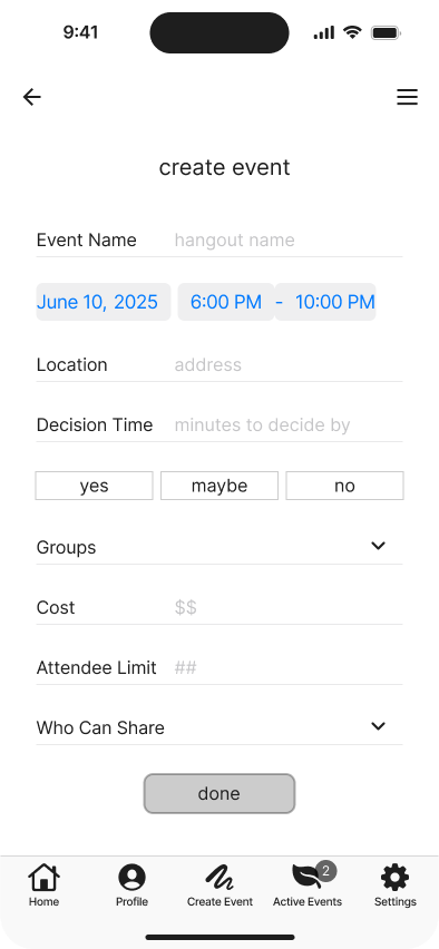
"Decision Time" Confusion: Users consistently misunderstood the term. Suggestions included "Deadline to Apply," "Registration Ends," or using a countdown or exact timestamp. Placement should be more intuitive—near the RSVP buttons or highlighted as a banner.
RSVP Clarity: "In/Out" terminology caused confusion. Preferred alternatives: “I’m In,” “Not Going,” or “Going/Not Going” (especially for older users). Users also requested the ability to respond “Maybe” or “Decide Later.”
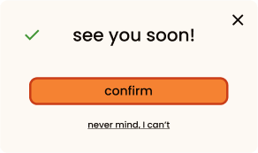
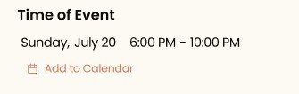
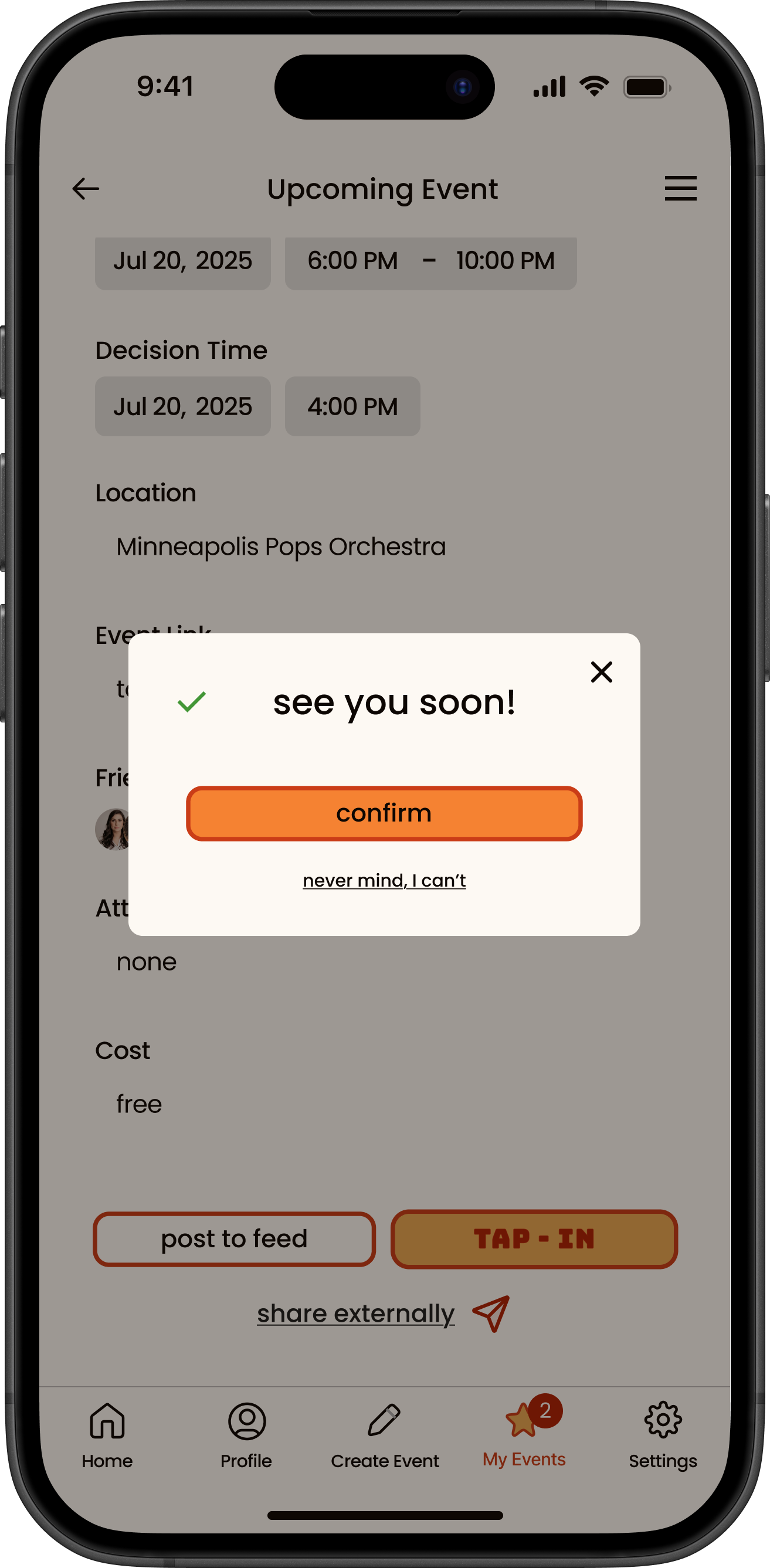
Feedback Confirmation: After RSVP, users want a clear confirmation (“See you soon!” with a checkmark or emoji) and an option to “Add to Calendar.”
Regret Messages: Users liked pre-written regret options (e.g., "Already have plans") with some customization. These should appear after declining, not before.
Users needed a clearer decision point when viewing events.
“Decision Time” was retained on the full event detail page but simplified into a live countdown timer on event cards, making urgency more digestible.
The RSVP buttons—“Tap-In” and “Out”—were maintained for branding consistency, but now trigger a confirmation pop-up to reassure users their choice was saved.
After a user taps out, they are shown optional regret messages and can write their own, reinforcing social accountability without cluttering the primary action.
2. Event Cards & Details
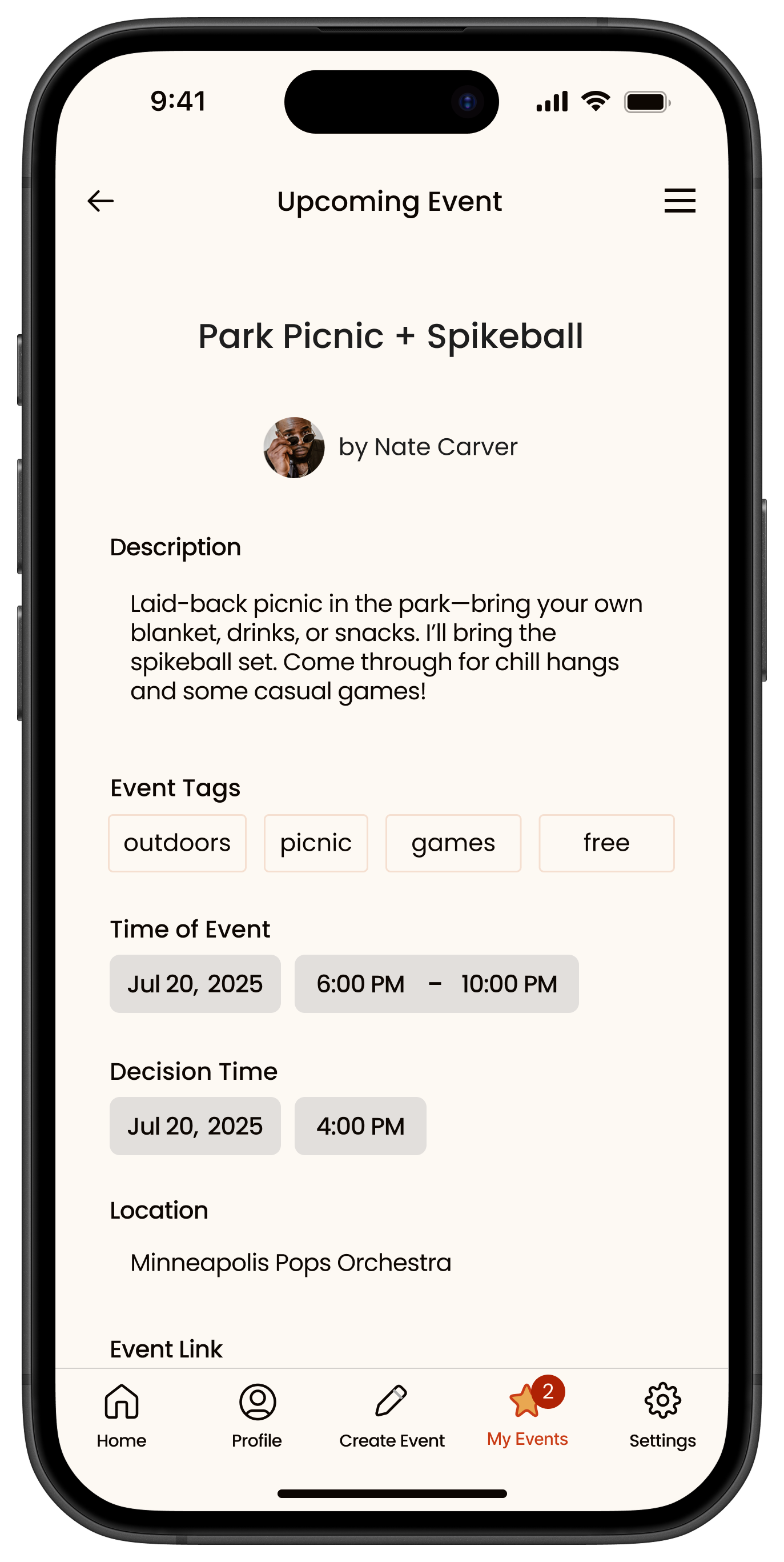
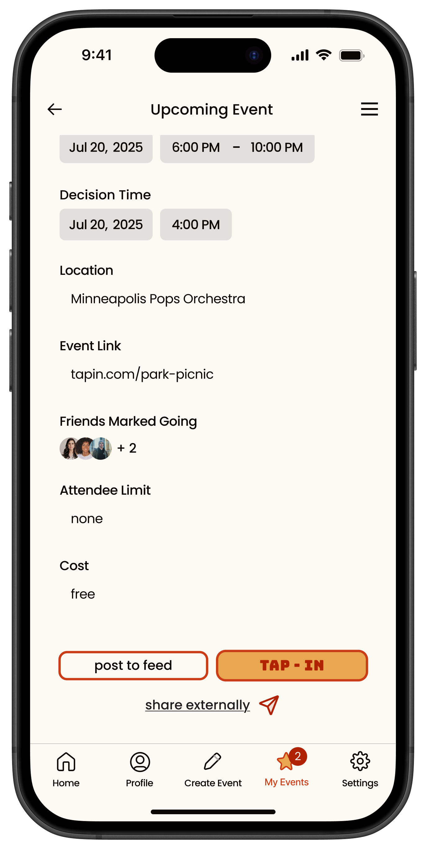
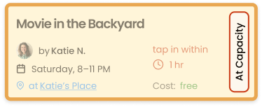
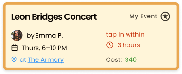
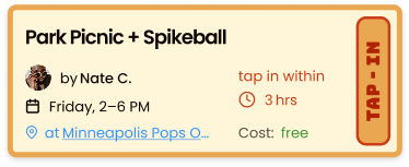
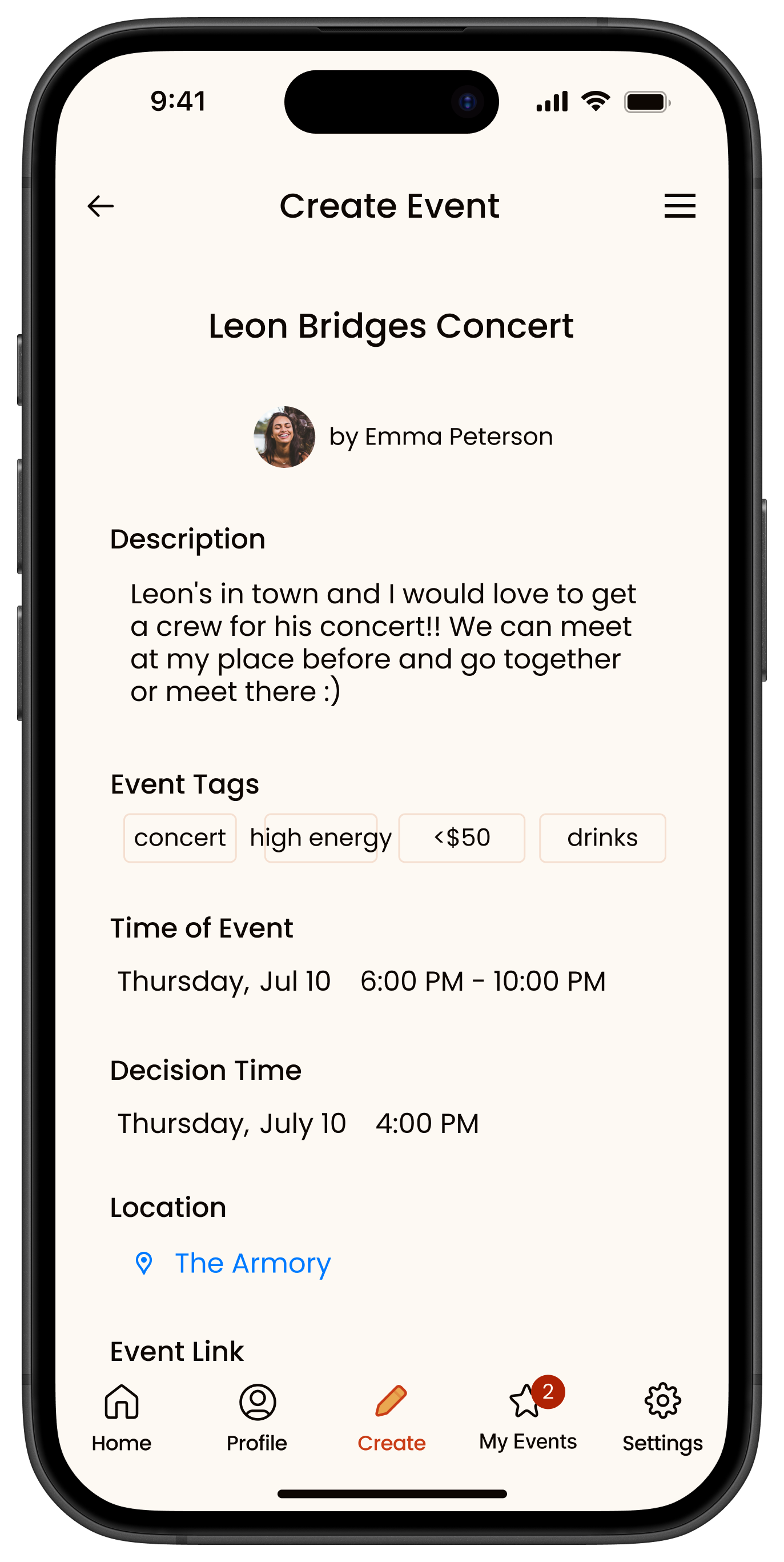
Information Density: Users want clearer, richer event cards showing:
Date & time (with date first)
Cost (if any)
RSVP deadline
Event summary or description (à la Partiful)
Visuals to "set the vibe" (user-chosen background images)
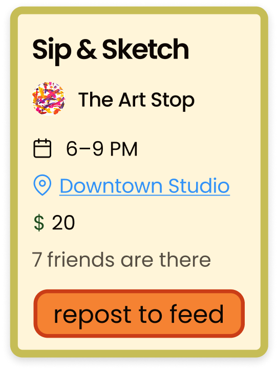
Sharing Features: Confusion between "repost" and "share." Suggested:
“Repost to Feed”
Use standard share icons for external sharing
Allow creators to control sharing permissions and enable +1s
Users wanted easier-to-scan cards with clearer event context.
Event cards were redesigned to prioritize the most important info—event name, time, RSVP deadline, and cost—without overwhelming the screen.
The “Repost” button was clarified to read “Post to Feed”, and “Share externally” was separated into underlined text with a share icon to distinguish functions.
These changes improve both legibility and action clarity across the event feed.

3. Navigation and layout
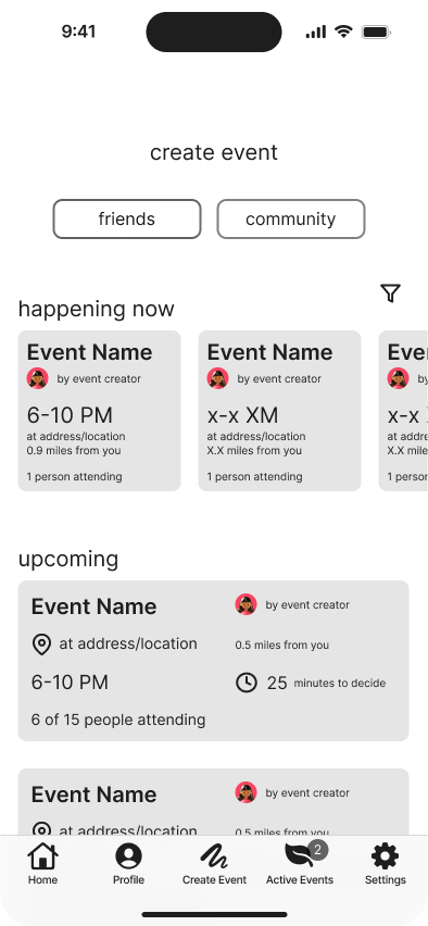
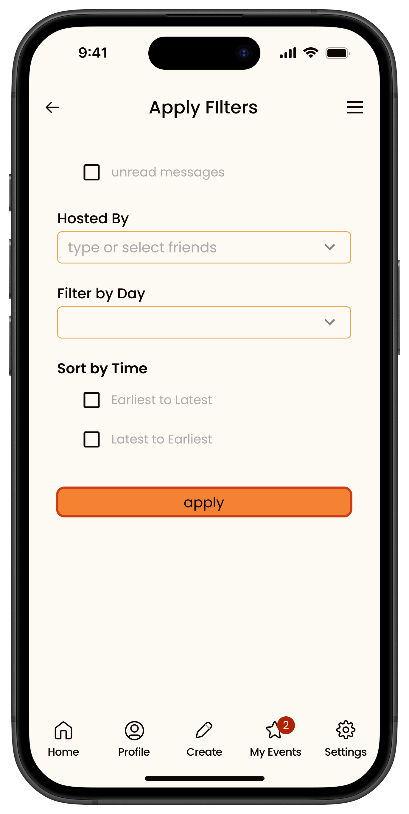
Homepage & Feed: Users want clearer hierarchy and easier access to upcoming events. Filters like “This Week,” “Next Week,” and “This Month” were requested.
"Create Event" Button: Placement was inconsistent—users suggested it be more visible and tied to a floating button or icon.
Home Icon: Include a clear home/dashboard icon to orient users.
Participants wanted better ways to find relevant events.
The “Upcoming Events” section now features filters so the user can automatically pick dates they are available.
A date filter was added so users can browse by time range (e.g., “Today,” “This Week”).
“Create Event” CTAs were added in more contextual areas to reduce friction and encourage spontaneous hosting.

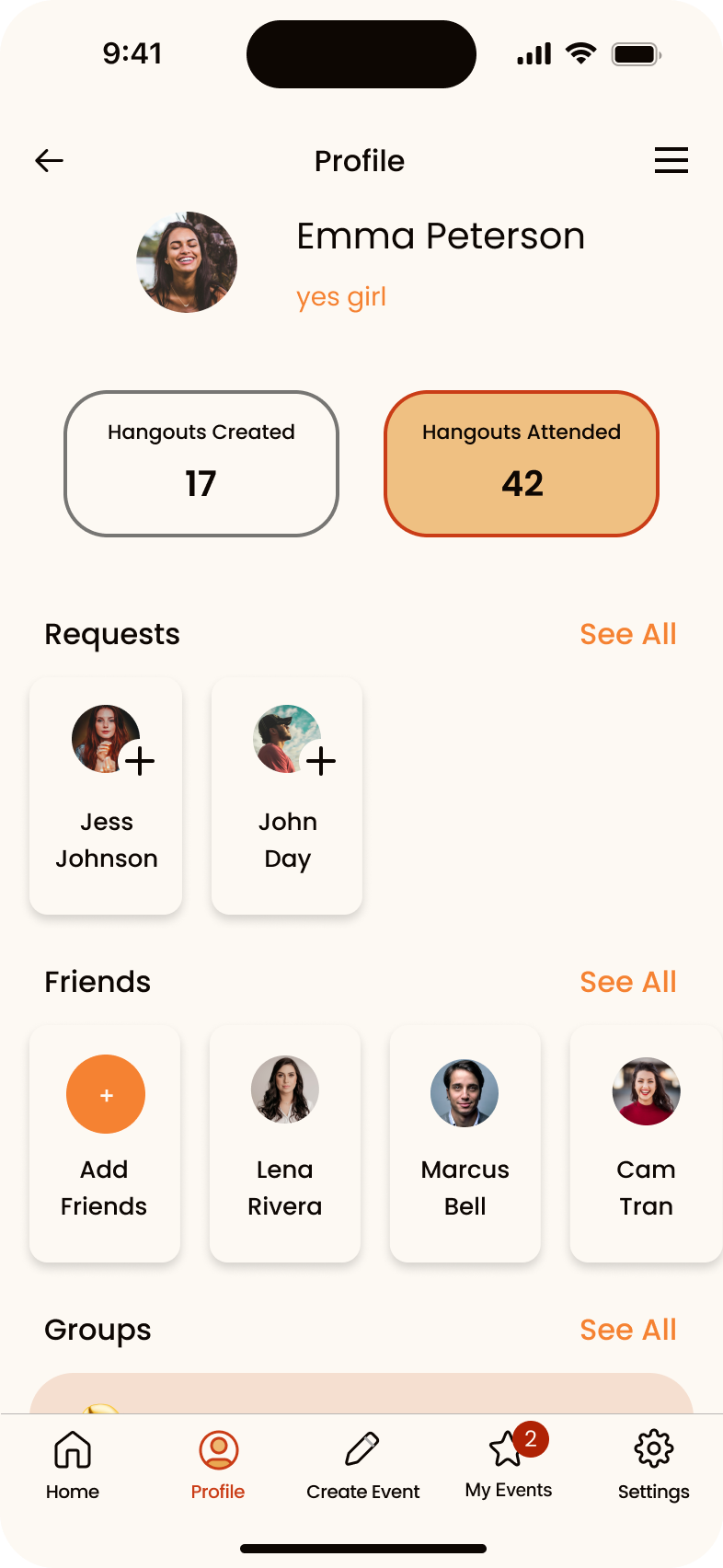
4. Profile Page & Friends
Event History & Groups: Users expect to see:
Attended and upcoming events
Created events
Archived chats
Popular groups & ability to join/leave them
Friend Management: Desired features include:
Adding/removing friends
Creating groups (e.g., “Runners,” “Foodies”)
Blacklisting/muting friends for notifications
Design Simplicity: Keep layout clean. “See All” pages for past events and friend groups improve clarity.
Testers expected more functionality around their personal and social info.
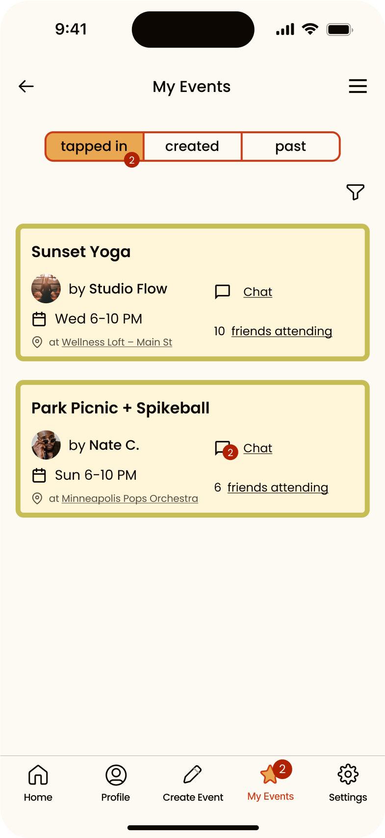
A new “My Events” page shows:
Events you’ve tapped into
Events you’ve created
Past events you’ve attended
Users can now add friends, create public or private groups, and view group chats within their profile.
A “See All” link was added for both friends and groups to improve content visibility.
Mute options were introduced in Settings to give users more control over who appears in their feed. (This mirrors familiar patterns from other social platforms.)
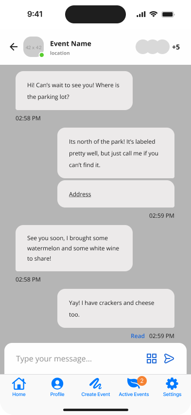
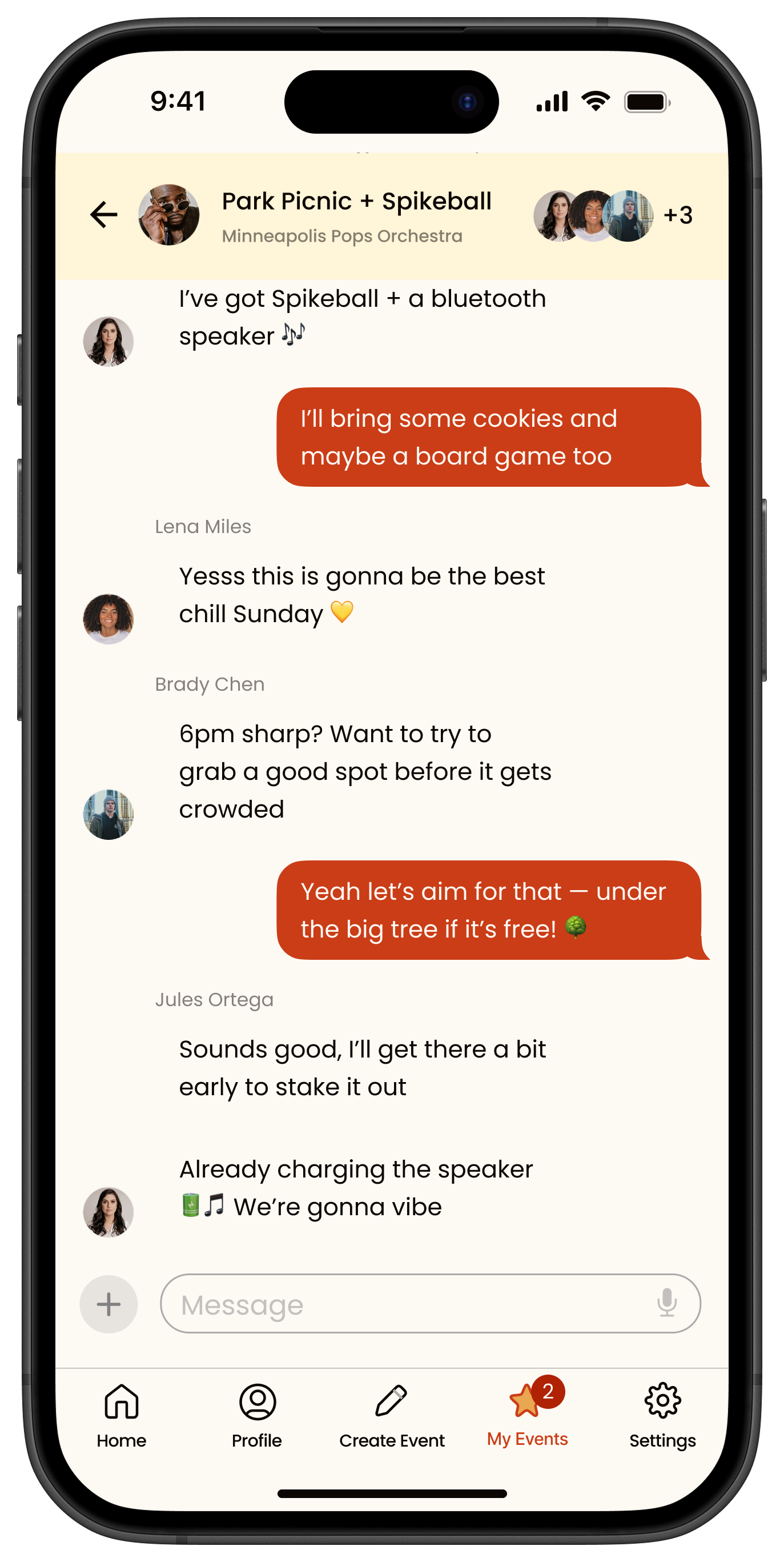
5. Chat & Notifications
Visibility Issues: Chat function was often hard to find. Suggestions:
Use color indicators, badges, or green dots for active chats
Display unread message counts tied to event names
Central Notification System: Needed to manage chat messages and RSVP alerts across events.
Users had trouble locating and understanding chat functionality.
The chat UI was redesigned for better discoverability and to match brand styling.
Unread message indicators were added to event/group cards to show where active conversation is happening.
To keep communication organized, all messages are now viewable only within the “My Events” tab.
6. Accessibility & Inclusivity
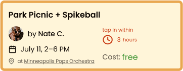
Participants expressed interest in filtering events by more than just date.
Users can now filter events by tags like “21+,” “Kid Friendly,” and more to better match their availability or preferences.
An “Add to Calendar” option was added below the event date, allowing users to sync events with external calendar apps of their choice.
Descriptive Language: Avoid jargon—especially for less tech-savvy users.
Event Details: Include info like age restrictions, child-friendliness, or accessibility.
Calendar Integration: Allow users to sync events to Google/Apple Calendar.
User testing flow
Task Flow
Discovery
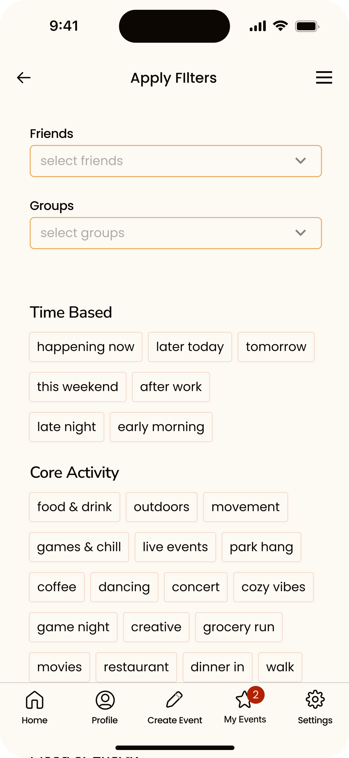
The journey begins when a user logs into the homepage and browses the events happening now and upcoming. They decide to look more into the event that their friend Nate is hosting because they love playing Pickleball.
Decision
The user sees more details on the event and sees that they can make it, is excited about all the other friends attending and that it’s free! They Tap-In to the event and get a confirmation pop up.
Interaction
The user joins the event and hops into the chat in order to see if there are any more details or things they should know before heading there. They decide to bring cookies and a board game for post spikeball hanging.

UI Kit
UI Kit
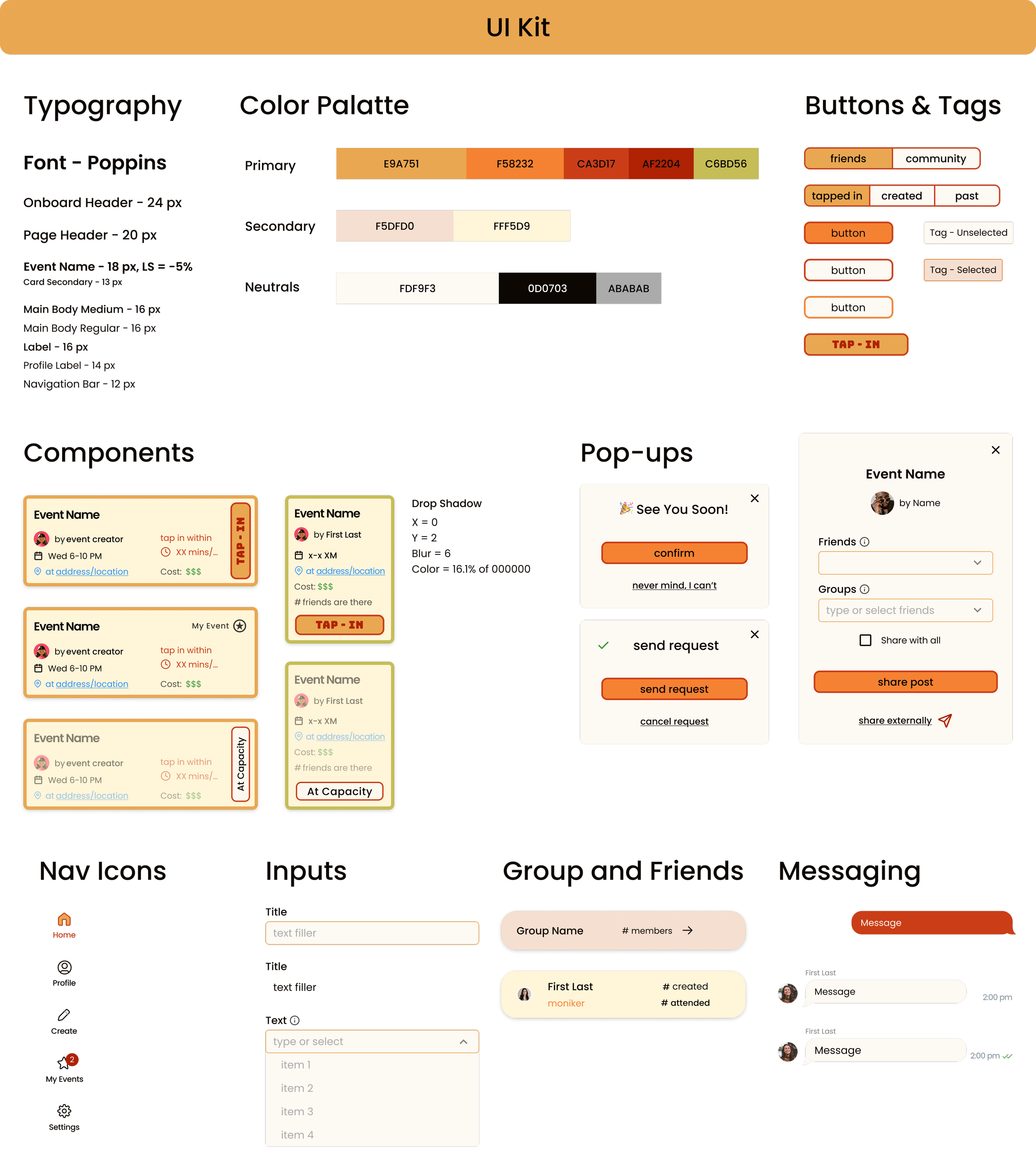
User interface kit
To support consistent and scalable design, I built a comprehensive UI kit that defines Tap In’s visual language and interaction patterns. It acts as a centralized guide for future designers and developers, ensuring every new feature aligns with the overall user experience.
The system includes typography styles, a structured color palette, and detailed component documentation for buttons, inputs, cards, and navigation. I outlined various states such as capacity-full events and interaction feedback, along with message formatting for chat and notifications.
Components are responsive and accessible, designed with proper contrast, spacing, and touch target sizing in mind. The visual system maintains Tap In’s warm and approachable tone, helping the app feel cohesive as it grows.
Design Iteration & Final Testing
Design Iteration & Final Testing
Usability Testing
To validate early design decisions and guide further iteration, I conducted five moderated usability interviews with potential users of Tap In. The sessions focused on first impressions, navigation patterns, and feature comprehension. Overall, users responded positively to the concept, praising its casual, spontaneous tone and intuitive interface. However, testing also revealed critical areas of confusion and friction—particularly around visual feedback, social functionality, onboarding flow, and event interaction. Based on these findings, I prioritized updates that clarified visual hierarchy, simplified forms, improved discoverability of key features (like chat and Tap In buttons), and enhanced social context through elements like overlapping profile photos, group tags, and ownership badges. These changes directly addressed user pain points while reinforcing the core value of quick, low-effort social coordination.
"I don't see a ton of difference when I look at, like, pre-tap in to, like, post-tap in."
- Rachel
"I would look at the title first, then the date, then how far away it was from me, and then the location."
- Kirsty
One thing I would put here is the skip option... Because this drives me nuts... I would scan these and I would just add a couple that I would like.”
- Kelsey
🔧 Design Changes & Improvements
To validate design decisions before final development, I conducted a second round of usability testing with 5 participants using the high-fidelity prototype. This round focused specifically on first impressions, navigation clarity, and feature comprehension to ensure the interface matched user expectations.
Testing revealed that while users responded positively to the concept and casual tone, several critical areas needed refinement. Based on these insights, I made targeted design changes across six key areas:
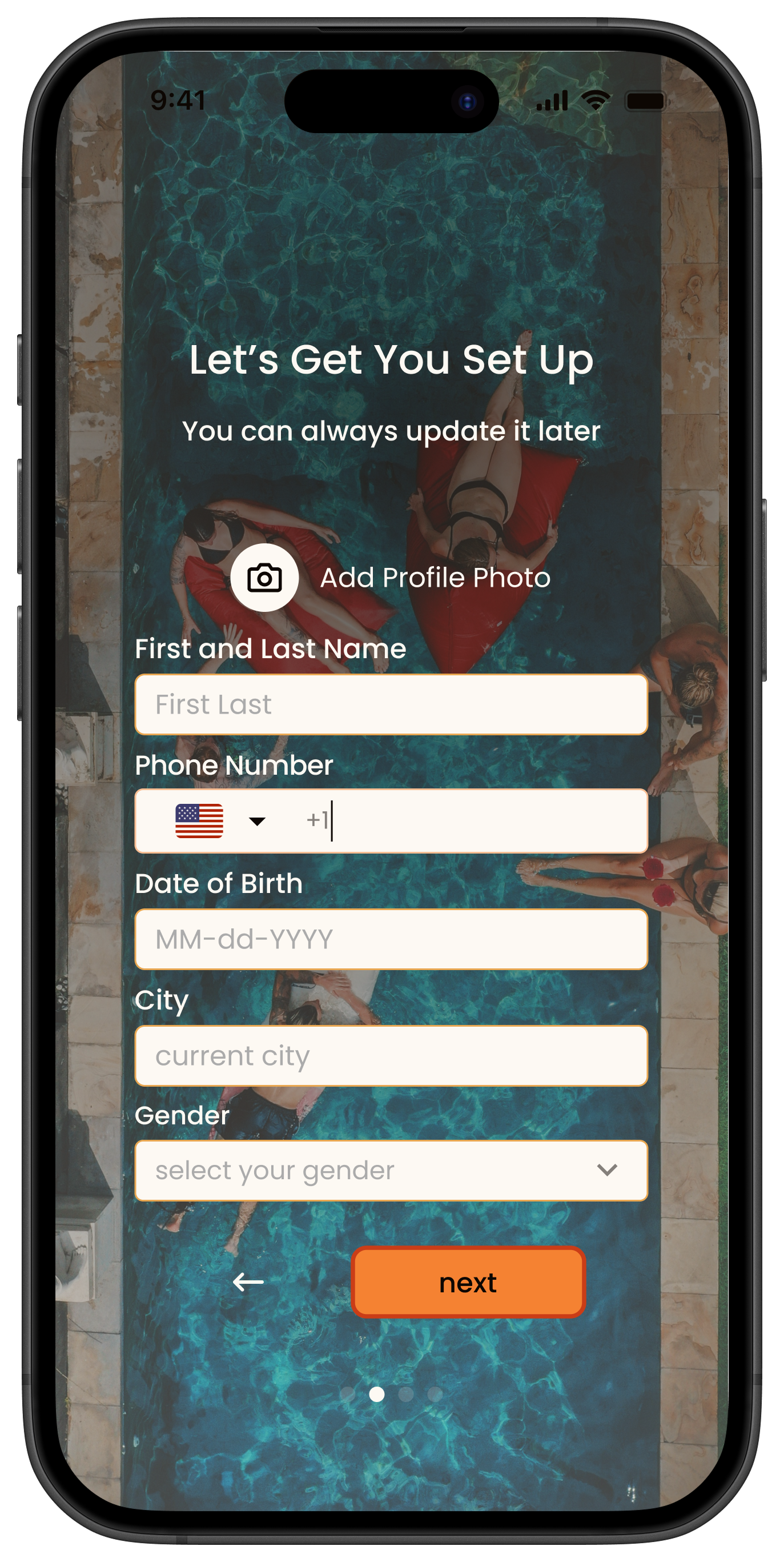
Onboarding & User Info
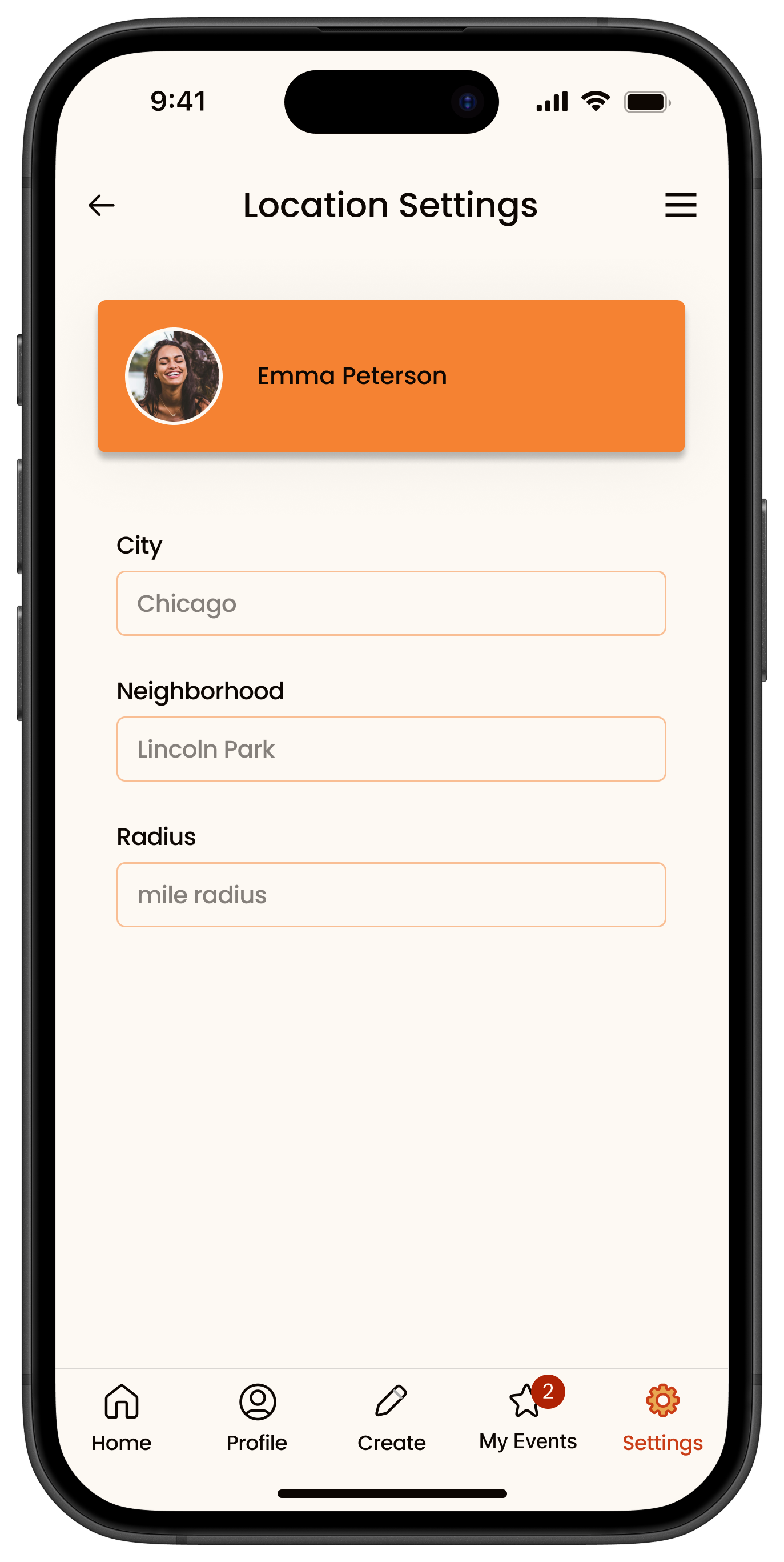
Updated location input to reflect the user’s current city instead of a full address, making it feel more lightweight and privacy-conscious.
Restructured onboarding to allow users to skip optional steps and enter key information first, reducing early friction.
Event details & social interaction
Increased the visibility and prominence of the group chat, turning it into a clear call-to-action button.
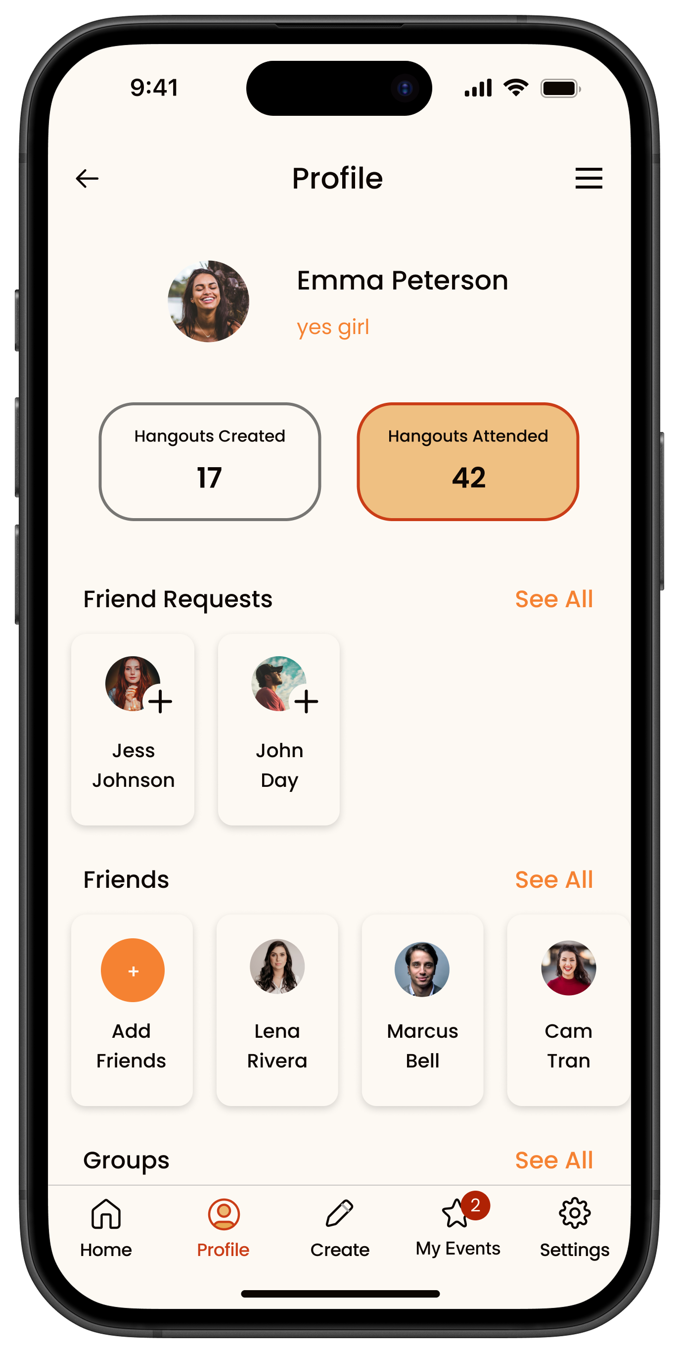
Replaced “Friends Going” with user photos and a "+X more" format, making it feel more social and engaging.
Made addresses, event links, and chat access more visibly tappable, improving discoverability.
Friends, Requests, & Groups
Renamed “Requests” to “Friend Requests” for clearer language.
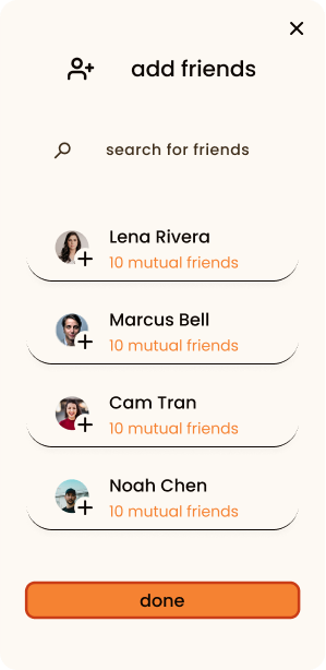
Enabled quick friend adds through shared groups, making it easier to connect with people in your social circles.
Event management & Visual Feedback
Added badges to events users created for quick identification.
Introduced a state for full events to clearly show when capacity has been reached.
Added a Tap In button to the event cards in the Upcoming Events list to support faster responses without opening each event.
Added a visual for the “Can’t Go” state, providing feedback for users opting out.
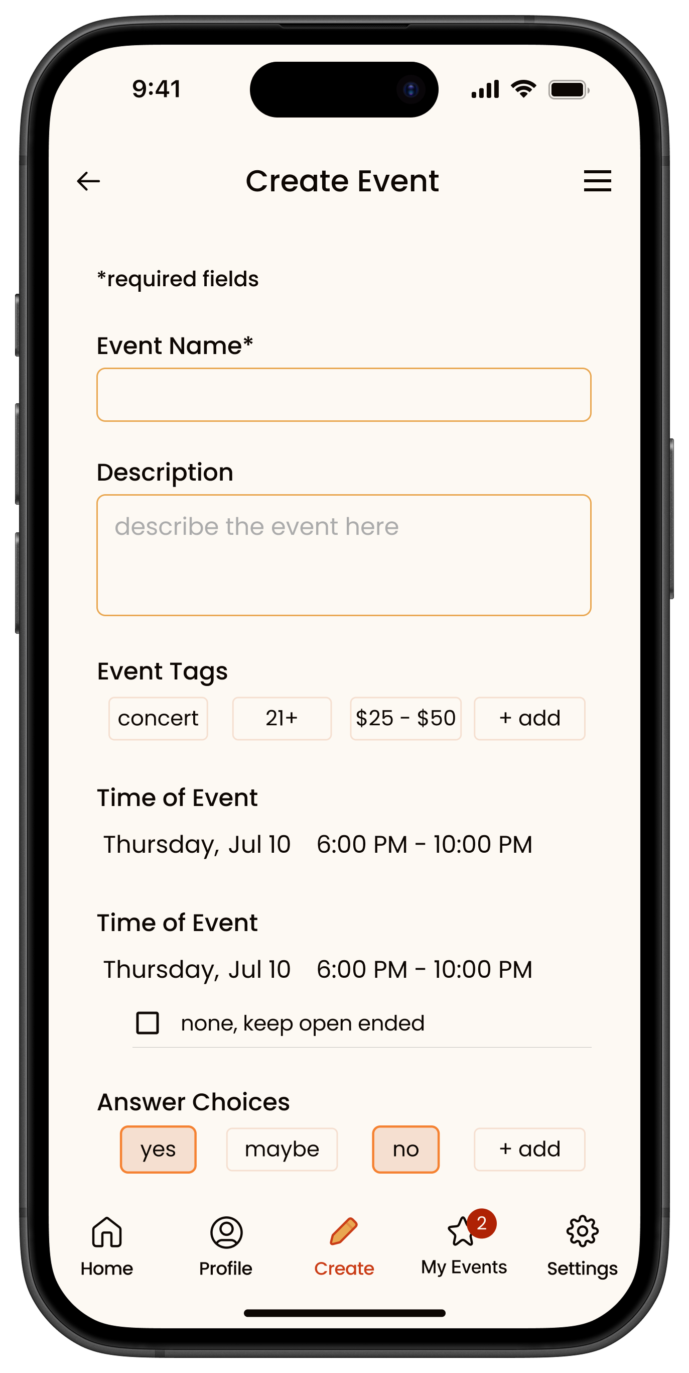
Forms & Fields
Improved visual distinction between filled-in vs. incomplete fields, giving users a clearer sense of what’s left to complete.
Simplified information fields by removing unnecessary data and eliminating distracting strokes on input lines for a cleaner layout.
Filters & location settings
Introduced a dedicated Location Settings page, allowing users to filter events by city and distance radius.
Refined filters to better match how users search for events — including filters for unread messages, events hosted by friends, and smarter time-based sorting.
HIgh Fidelity Prototype
HIgh Fidelity Prototype
Interactive Prototype
The high-fidelity prototype incorporates all key updates from the latest round of usability testing, including improvements to navigation, visual hierarchy, event interaction, and social features. D
esigned in Figma, the clickable prototype allows users to simulate the full app experience—from onboarding and browsing events to tapping in and interacting with groups.
This version reflects a polished and functional vision of the app, showcasing how user feedback directly informed design decisions. Click the images or button below to explore the live prototype.
Future Considerations
Future Considerations
As TAP-IN continues to grow, there are several feature expansions that could enhance the platform’s community-building potential and overall user experience.
One key area of development is the introduction of public groups. This would allow users to browse and join broader interest-based communities (e.g., runners, creatives, gamers), offering more opportunities for spontaneous connection beyond private circles. Each group would include a designated moderator role to help manage member engagement, approve or guide event creation, and ensure respectful interactions within the group.
Another potential enhancement is the ability to view friends' profiles, providing a more social layer to the app. With proper privacy controls, users could see which events their friends have “tapped into”, helping surface relevant or interesting hangouts through peer discovery. Hosts would be able to set visibility preferences so events can be made public, semi-public, or private.
As the user base grows and evolves, so too will TAP-IN’s features. The app will continue to adapt based on user feedback, behavioral insights, and emerging needs. Future updates will prioritize user feedback, behavioral insights, and emerging social patterns to ensure Tap In evolves with its community while maintaining the spontaneity and simplicity that define the core experience.